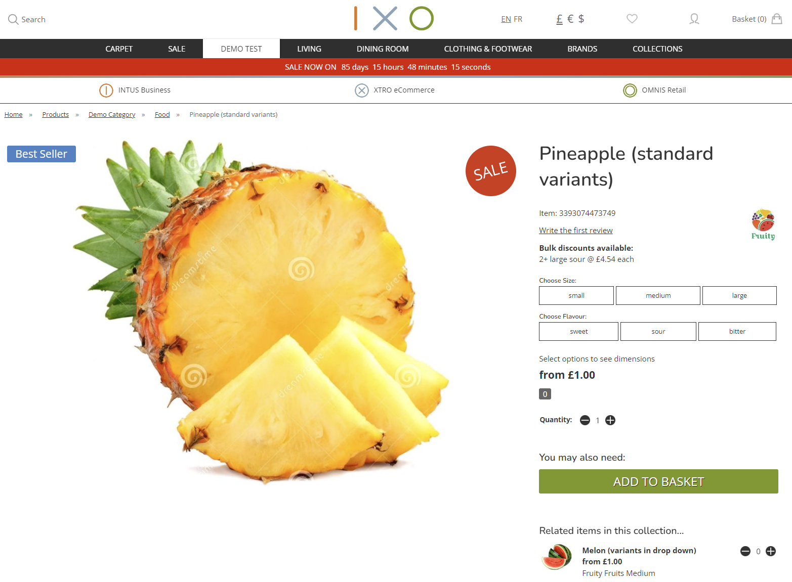
Product Detail Page
Summary
This is the product detail page.
Swatch Panel
The Swatch Preview Panel will display for eCommerce customers, as well as in CMS and POS. This is intended to show a secondary image related to the current selection. This will either present:
- a linked secondary image
- a larger version of the Swatch
Set Up
This must be applied on individual Products; those Products must have multiple images.
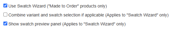
1. Product Tab
Ensure that these are ticked on the Product Tab:
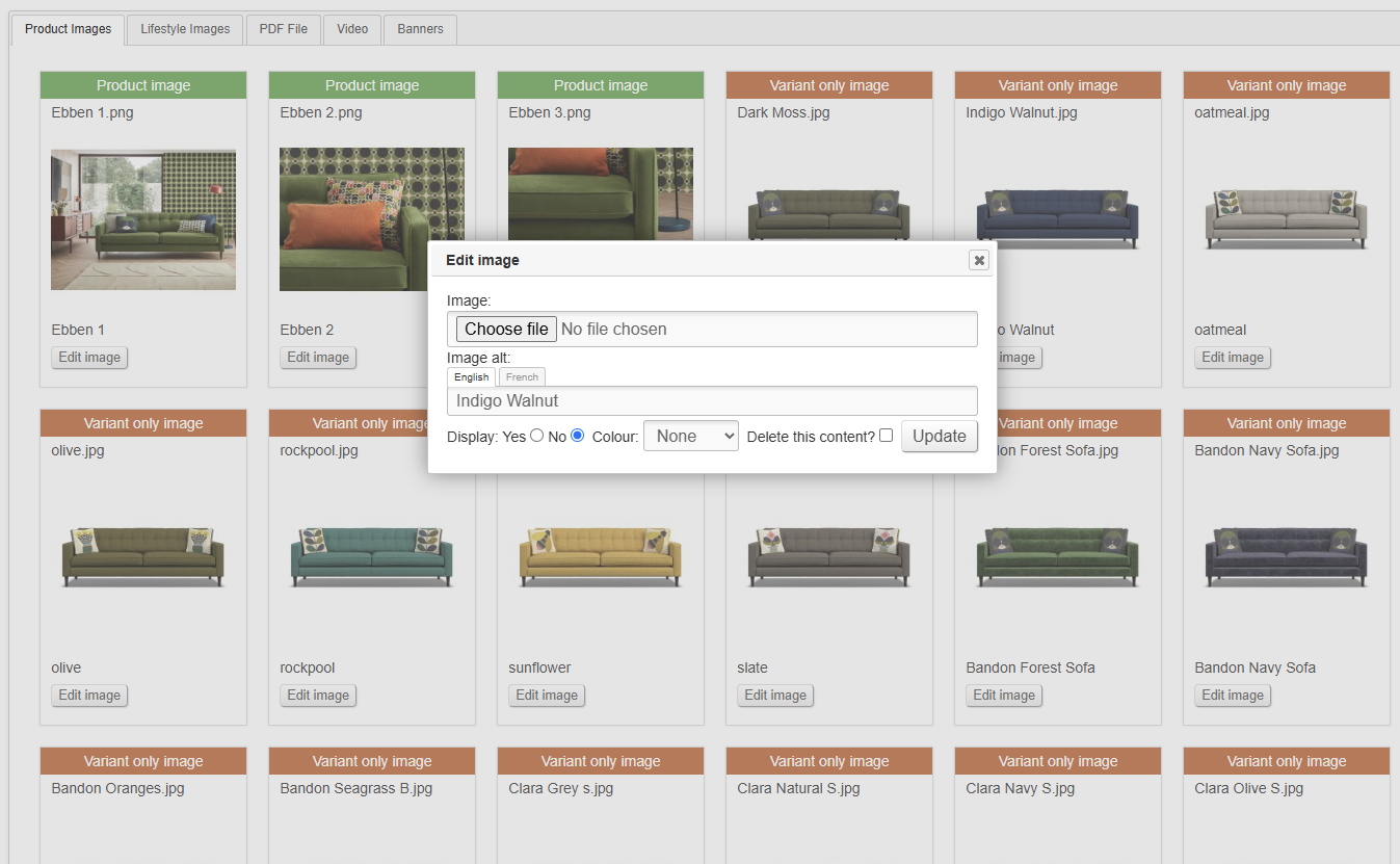
2. Images
Upload multiple images to the Product using the normal methods. Typically, these should be set as 'Variant only images'.
3. Customisations
Link Customisations to additional images.
Via CMS Dropdowns
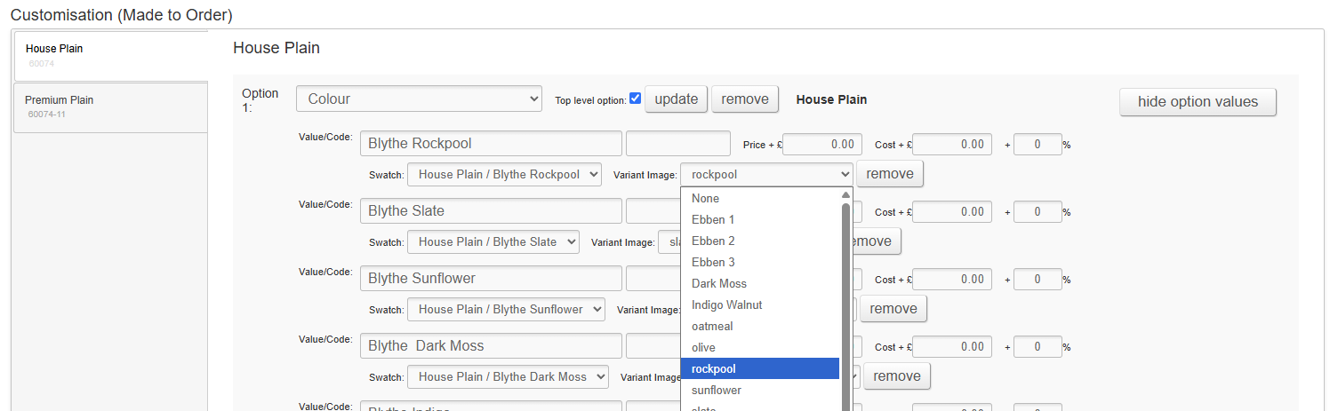
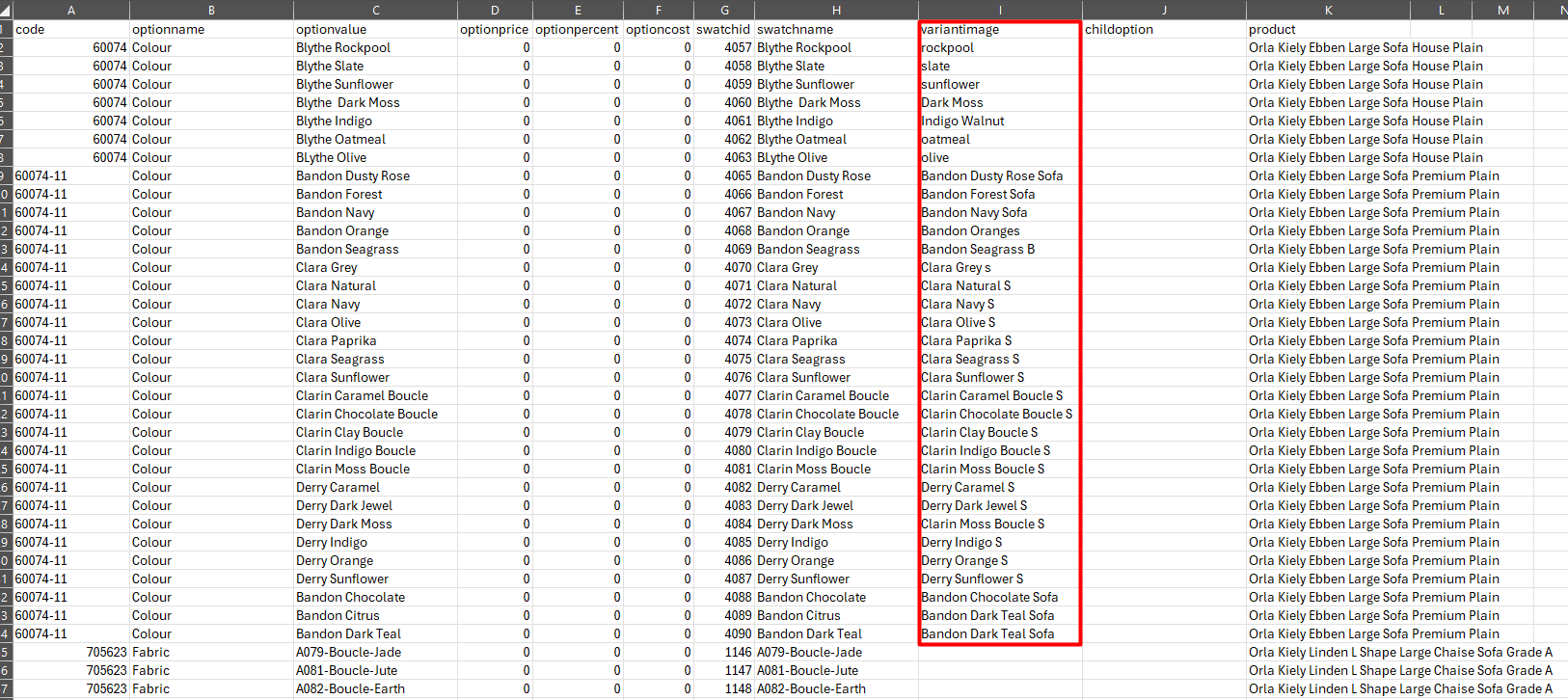
Via CSV
The link can also be made via the Made to Order import.
How it displays
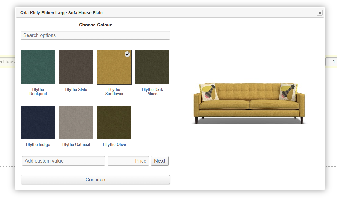
If enabled, and if a secondary image is linked to the Customisation, that secondary image will be shown in a panel on the right hand side of the Swatch Wizard.
If no secondary image is linked, a larger version of the Swatch will be displayed instead.
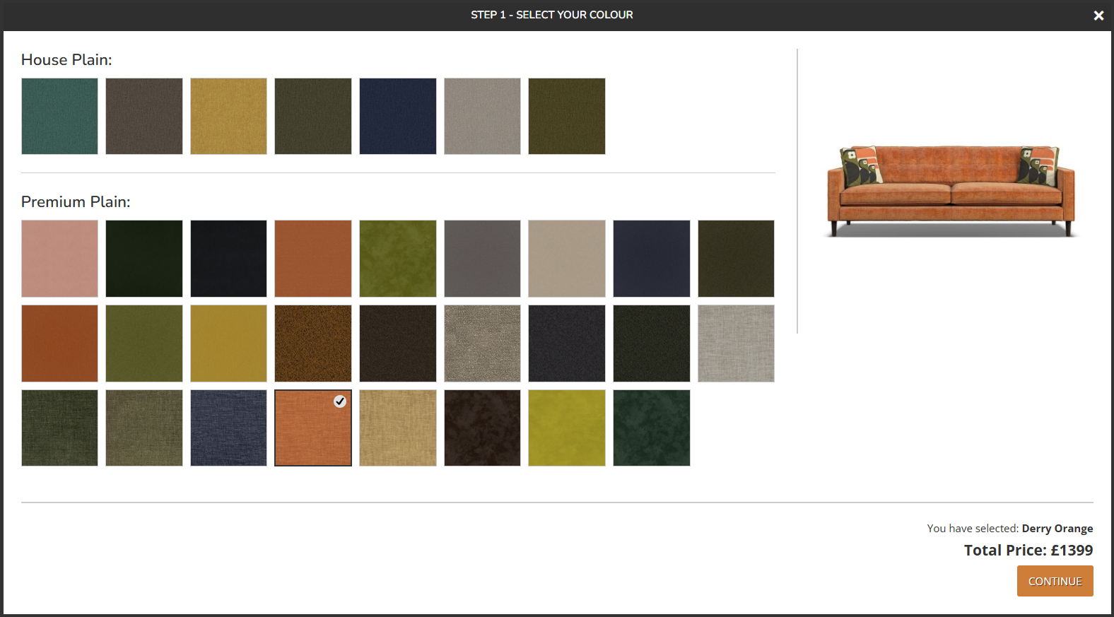
eCommerce
The example below is taken from a Product where 'Combine Variant and Swatch Selection if Applicable' is set to 'yes'.
CMS

POS
Swatch Wizard
If enabled on the Product tab when editing a Product, Customisations (MTO options) will be presented to the Customer in a pop up on the website.
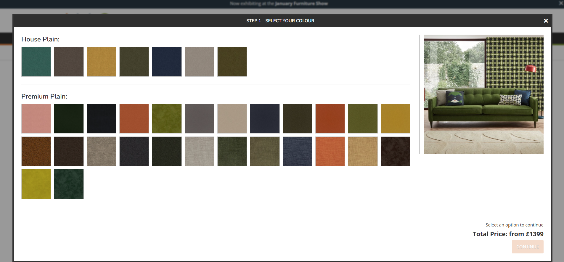
Favourite Swatches will be shown with a star; these will also be highlighted on the Product Listing Page.
The Swatch Preview Panel (secondary image to the right) may also be controlled by linking Variant Images to individual Customisations.
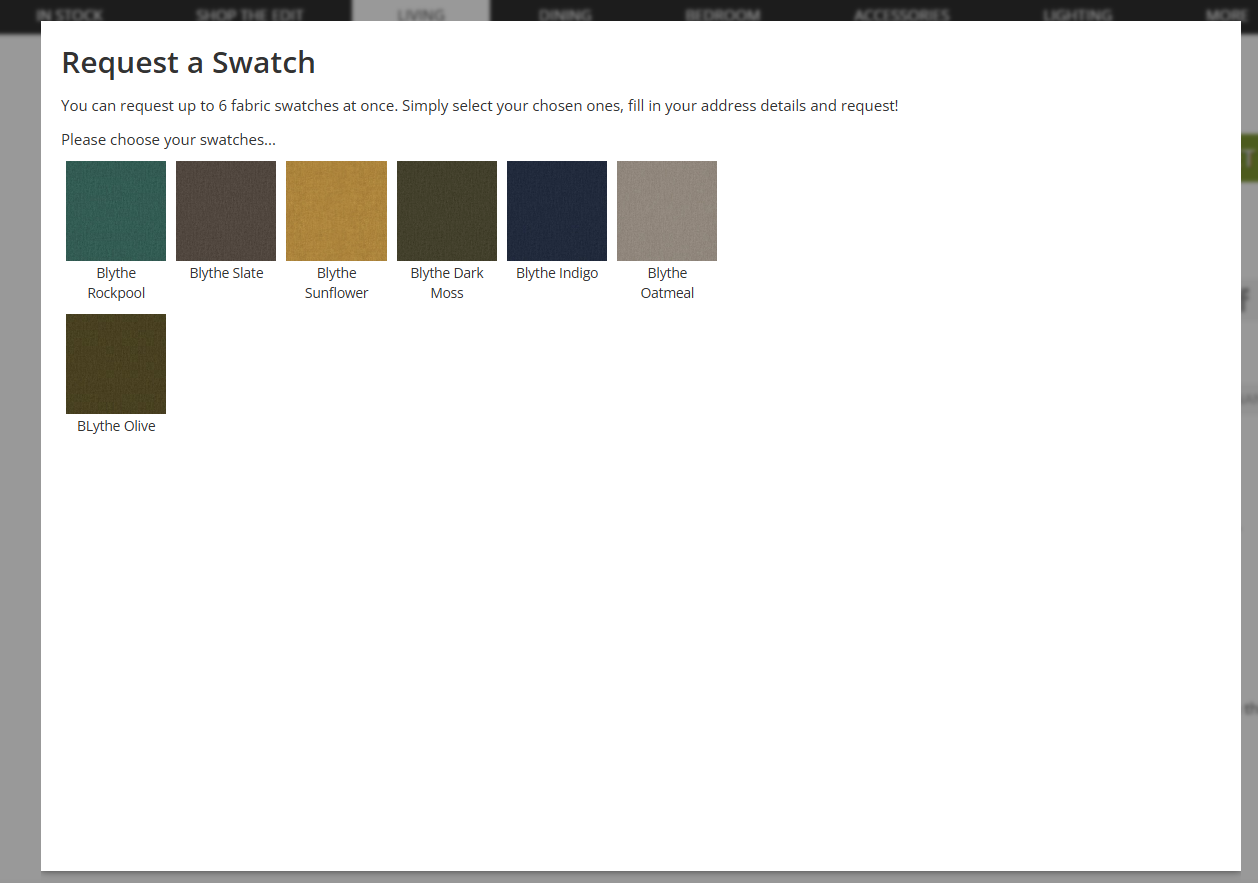
Swatch Request Popup
This is an option that can be enabled on the Product tab when editing a Product in the CMS.
This will trigger a popup on the Product Detail Page, where a customer can request swatches.
These swatches will be Customisations linked to Swatch, if that Swatch has been appropriately enabled.
This will generate an email enquiry.
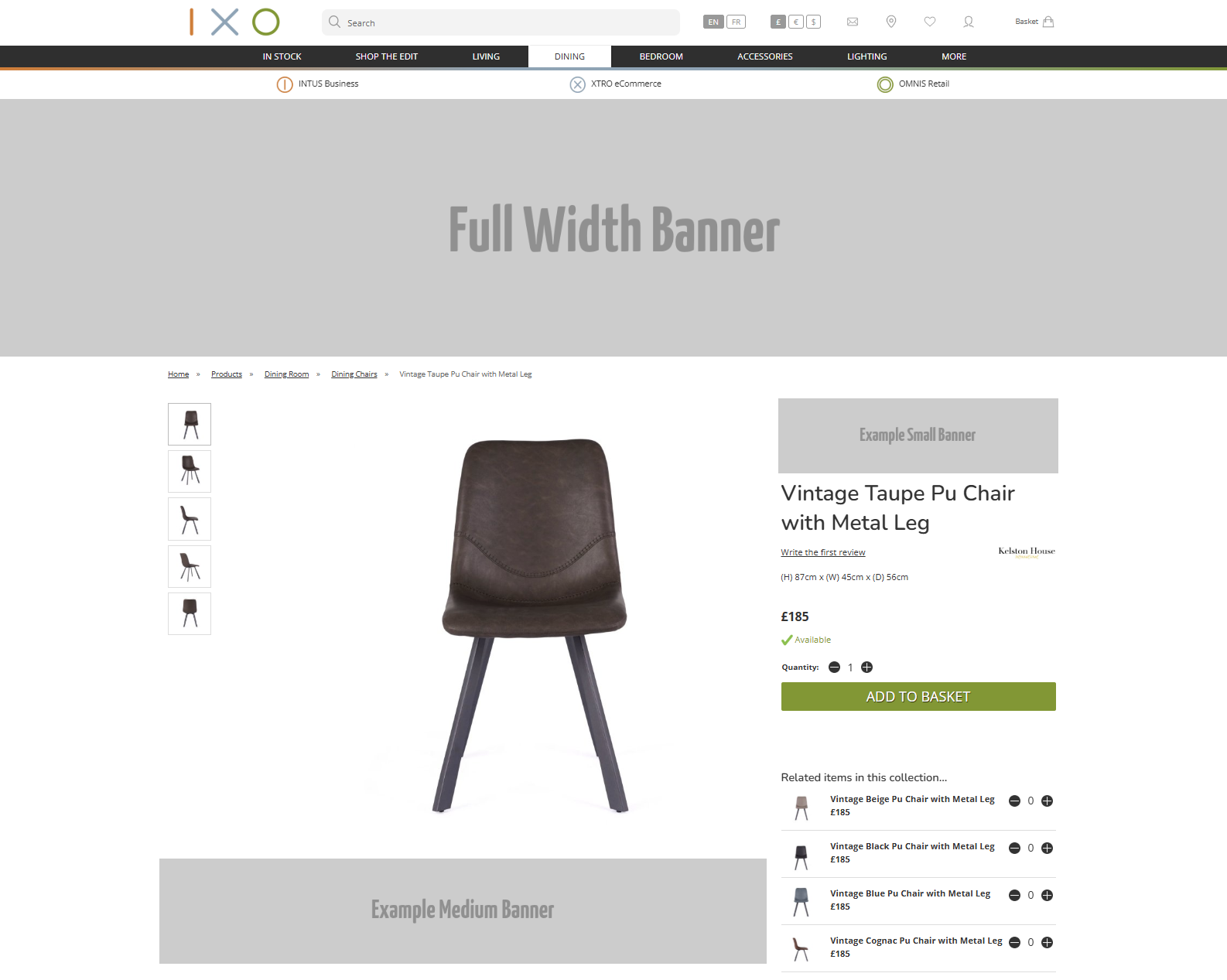
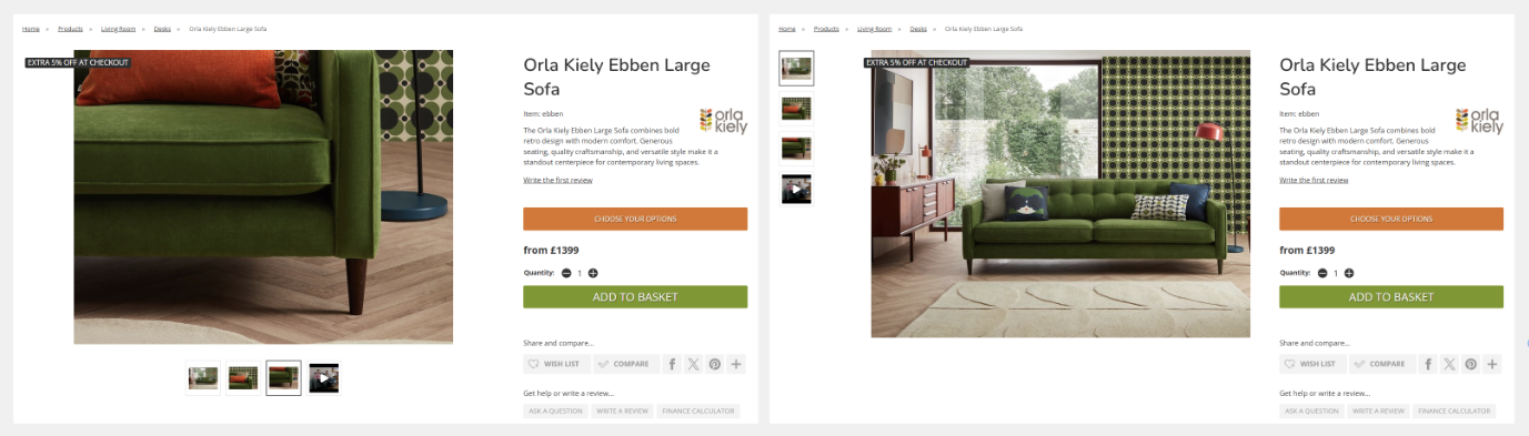
Banners (PDP)
Here is an example of where Banners will output on the Product Detail Pages.
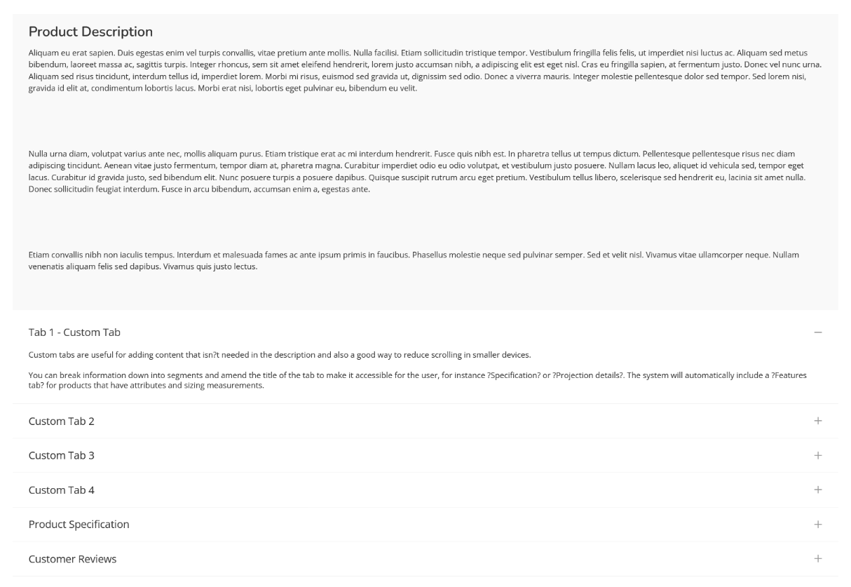
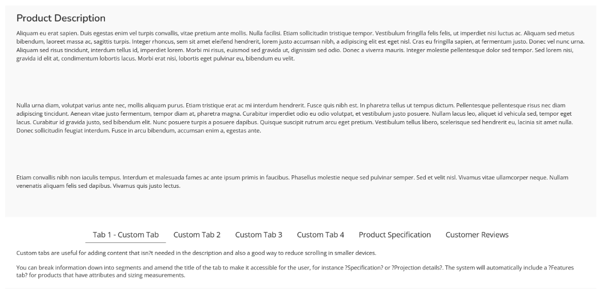
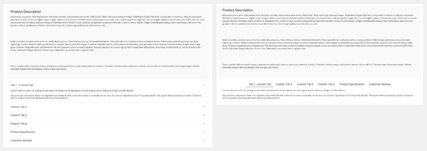
Tabs
Tabs on the Product Detail Page may be laid out vertically or horizontally.
Vertically
Horizontally
PDP Customisation
There are a variety of settings that will make changes to the PDP. These are listed below.
Image magnification (pop up with the full image size) will only be available if the original image is large enough to support this.
Secondary image placement
Additional Product images may either be located to the left, or below, the primary image.
The actual size of the image rendered on screen is affected by the size of the original image, as well as the size of the device being used to view the PDP. The smaller the window (horizontally or vertically), the smaller the image will be; the platform will attempt to always show the whole image on page load, dynamically resizing the image if necessary.
This setting may only be changed by Iconography.
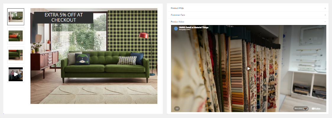
Video as an image thumbnail
By default, videos added to Products will be displayed as a tab. Alternatively these may be viewed as an image thumbnail.
If set to show the image as a thumbnail, when clicked, it will auto-play in a pop up, but muted.
This may be controlled in Site Settings as a global setting for all Products.
Product description styled as first tab
By default, Product descriptions are styled separately. These will be visible on the page, and stand apart from the product tabs. The description may have a different appearance including, but not limited to coloured backgrounds and fonts.
If styled as a tab, the Product description will be set to be open on page load
This setting may only be changed by Iconography.
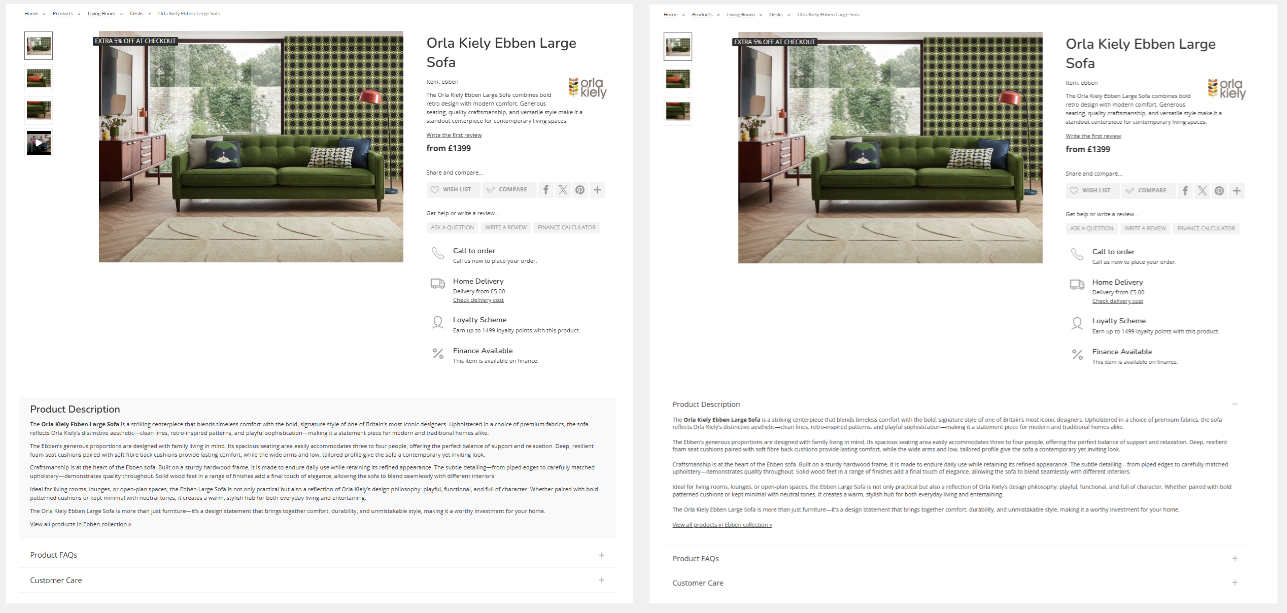
Tabs styled horizontally or in an accordion
Tabs may be styled in one of two ways. In both cases, only the first tab will be open.
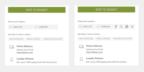
Show/hide social share buttons
This will show or hide the social share buttons, as below.
This setting may only be changed by Iconography.