# Product Listing Page

# Hide Left Navigation

This will allow the user to toggle how the left hand navigation appears on Product Listing Pages and Content Pages.

## Product Listing Pages

### With Left Hand Navigation

The filters will always be displayed on the screen.

[![image.png](https://bookstack.iconography.co.uk/uploads/images/gallery/2024-09/scaled-1680-/gVrimage.png)](https://bookstack.iconography.co.uk/uploads/images/gallery/2024-09/gVrimage.png)

### Without Left Hand Navigation

Filters are hidden by default, and are opened by interacting with the 'Filter' button in the top left of the screen.

[![image.png](https://bookstack.iconography.co.uk/uploads/images/gallery/2024-09/scaled-1680-/rqlimage.png)](https://bookstack.iconography.co.uk/uploads/images/gallery/2024-09/rqlimage.png)

## Content Pages

### With Left Hand Navigation

[![image.png](https://bookstack.iconography.co.uk/uploads/images/gallery/2025-11/scaled-1680-/WbXimage.png)](https://bookstack.iconography.co.uk/uploads/images/gallery/2025-11/WbXimage.png)

### Without Left Hand Navigation

[![image.png](https://bookstack.iconography.co.uk/uploads/images/gallery/2025-11/scaled-1680-/eQkimage.png)](https://bookstack.iconography.co.uk/uploads/images/gallery/2025-11/eQkimage.png)

# Filters

## Filter by Colour

this links back to the Colour that can be set against product [images](https://bookstack.iconography.co.uk/books/categories/page/media "Media")

# Product Layouts

The below layout options are available when setting up your Categories. These only apply t Product layout, and not to Collections, sub Categories, or other content.

## Grid

### 2 Column

A simple two column layout of Products.

[![image.png](https://bookstack.iconography.co.uk/uploads/images/gallery/2025-12/scaled-1680-/2ekimage.png)](https://bookstack.iconography.co.uk/uploads/images/gallery/2025-12/2ekimage.png)

### 3 Column

A simple three column layout of Products.

[![image.png](https://bookstack.iconography.co.uk/uploads/images/gallery/2025-12/scaled-1680-/48Rimage.png)](https://bookstack.iconography.co.uk/uploads/images/gallery/2025-12/48Rimage.png)

### 4 Column

A simple four column layout of Products.

[![image.png](https://bookstack.iconography.co.uk/uploads/images/gallery/2025-12/scaled-1680-/UXQimage.png)](https://bookstack.iconography.co.uk/uploads/images/gallery/2025-12/UXQimage.png)

## List

### Standard List

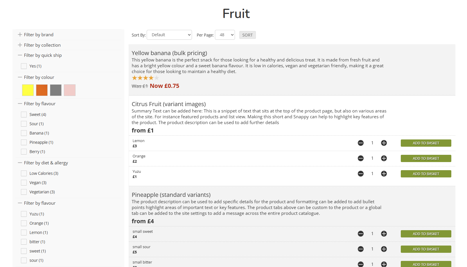
Sets the Category to be in list view. This will display the Product Summary on the Product Listing Page.

[![image.png](https://bookstack.iconography.co.uk/uploads/images/gallery/2025-12/scaled-1680-/UEFimage.png)](https://bookstack.iconography.co.uk/uploads/images/gallery/2025-12/UEFimage.png)

### Compact List

Sets the Category to be in a compact list This will display the Product Summary on the Product Listing Page, and also split out the Variants for immediate purchase from the Product Listing Page.

<p class="callout info">This is ideal for Products for simple options, e.g. sizing, or where you expect a Customer to purchase multiple items from the same Product Listing Page</p>

[![image.png](https://bookstack.iconography.co.uk/uploads/images/gallery/2025-12/scaled-1680-/QOyimage.png)](https://bookstack.iconography.co.uk/uploads/images/gallery/2025-12/QOyimage.png)

## Advanced

### 3 Column (first large)

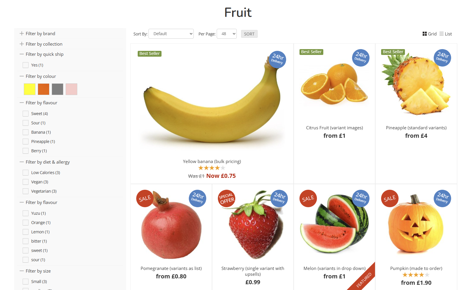
A three column layout, with the first Product displayed at double height.

[![image.png](https://bookstack.iconography.co.uk/uploads/images/gallery/2025-12/scaled-1680-/JAQimage.png)](https://bookstack.iconography.co.uk/uploads/images/gallery/2025-12/JAQimage.png)
### 4 Column (first large)

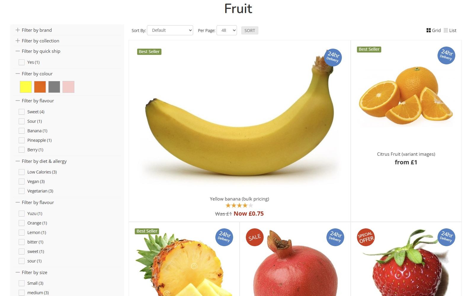
A four column layout, with the first Product displayed at double height.

[![image.png](https://bookstack.iconography.co.uk/uploads/images/gallery/2025-12/scaled-1680-/Q1jimage.png)](https://bookstack.iconography.co.uk/uploads/images/gallery/2025-12/Q1jimage.png)
### 3 Column (original aspect)

A three column layout, which will retain the original aspect ratio of the uploaded image without cropping.

### 4 Column (original aspect)

A four column layout, which will retain the original aspect ratio of the uploaded image without cropping.

## Funky

### Funky (alternating)

An alternating layout, which moves between two and three column layouts.

[![image.png](https://bookstack.iconography.co.uk/uploads/images/gallery/2025-12/scaled-1680-/oEqimage.png)](https://bookstack.iconography.co.uk/uploads/images/gallery/2025-12/oEqimage.png)

###   
Mega-Funky (mixed)

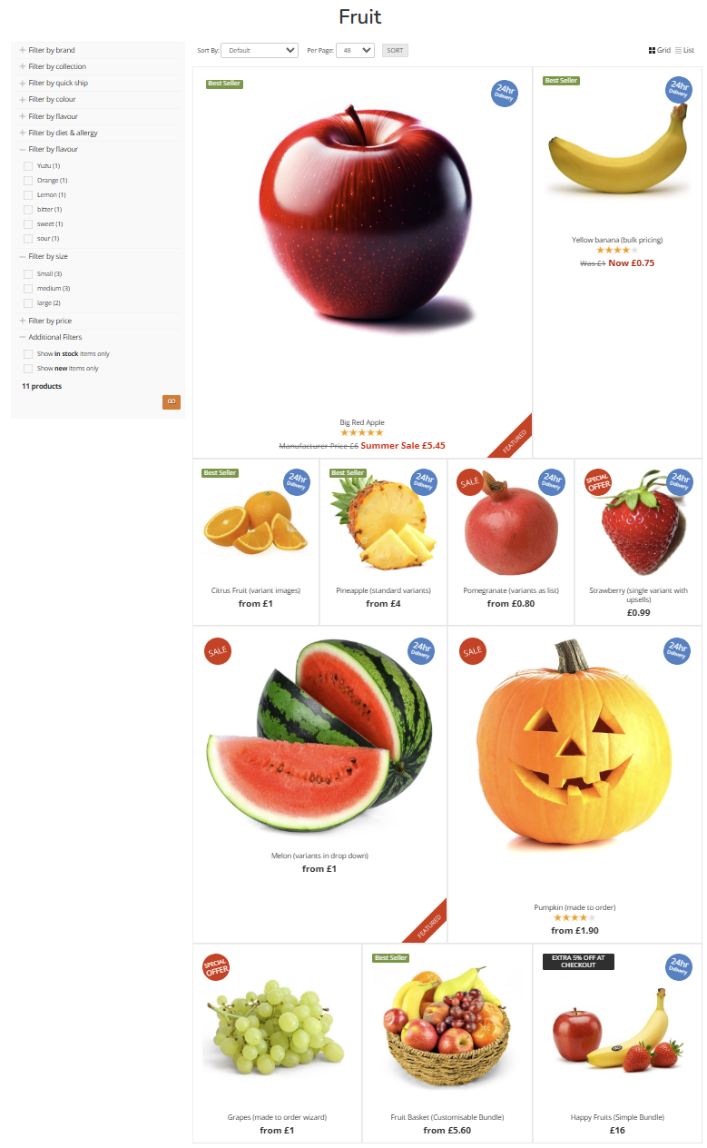
The largest variety of layouts in a single view; this will combine a mix of all other layouts to break up the page.

[![image.png](https://bookstack.iconography.co.uk/uploads/images/gallery/2025-12/scaled-1680-/ERPimage.png)](https://bookstack.iconography.co.uk/uploads/images/gallery/2025-12/ERPimage.png)
# Swatch Previews

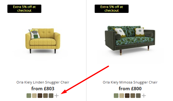
This option will display a Swatch Preview below the Product on Product Listing Pages.

<p class="callout info">This will only display if customisations are linked to the Product</p>

If enabled against the Listing Page (e.g. Category, Brand or Collection), five swatches will display. If set against a Product's [Customisations](https://bookstack.iconography.co.uk/books/categories/page/customisation "Customisation"), the first five 'favourite' swatches will be shown.

[![image.png](https://bookstack.iconography.co.uk/uploads/images/gallery/2025-10/scaled-1680-/nPAimage.png)](https://bookstack.iconography.co.uk/uploads/images/gallery/2025-10/nPAimage.png)
# Banners (PLP)

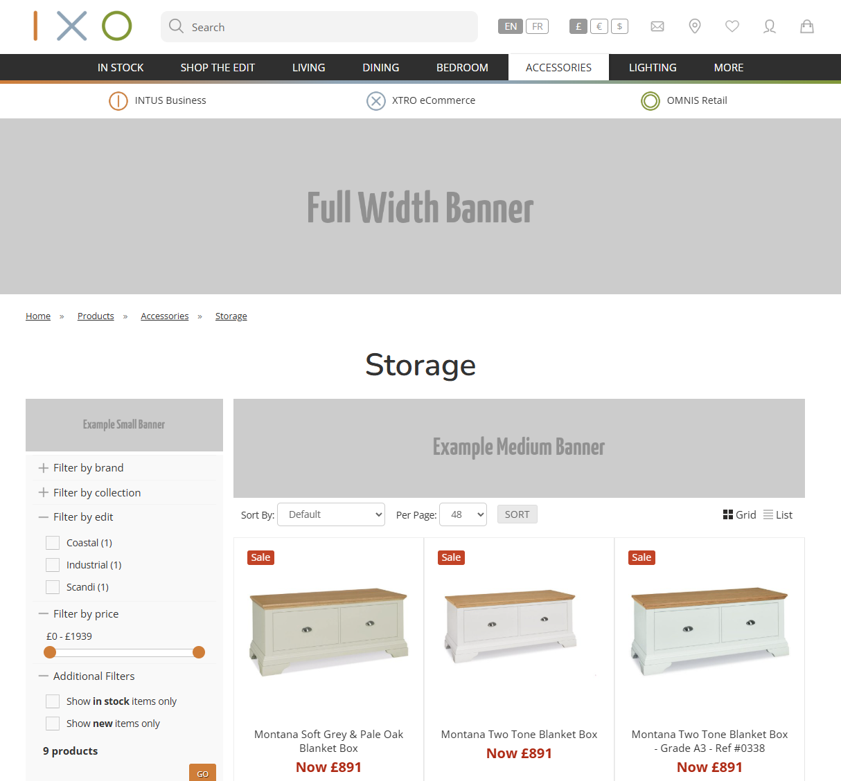
### With Left Navigation

[![image.png](https://bookstack.iconography.co.uk/uploads/images/gallery/2025-11/scaled-1680-/PQJimage.png)](https://bookstack.iconography.co.uk/uploads/images/gallery/2025-11/PQJimage.png)
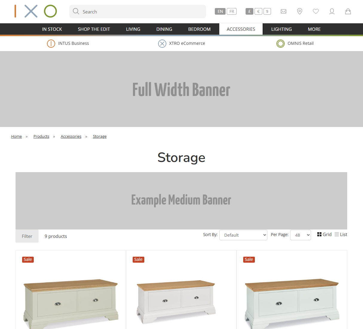
### Hide Left Navigation

[![image.png](https://bookstack.iconography.co.uk/uploads/images/gallery/2025-11/scaled-1680-/aSRimage.png)](https://bookstack.iconography.co.uk/uploads/images/gallery/2025-11/aSRimage.png)
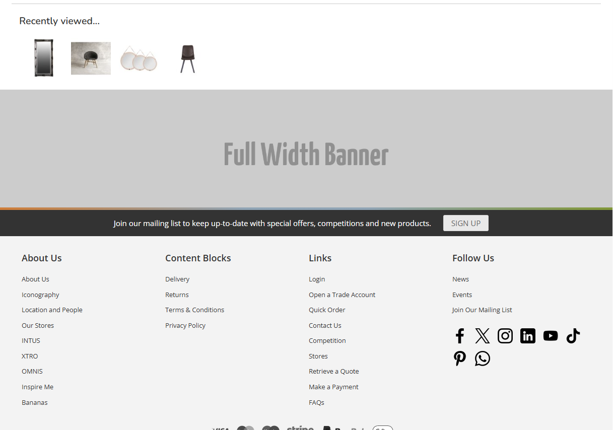
### Footer

[![image.png](https://bookstack.iconography.co.uk/uploads/images/gallery/2025-11/scaled-1680-/Agyimage.png)](https://bookstack.iconography.co.uk/uploads/images/gallery/2025-11/Agyimage.png)
# Sub Categories

### Default

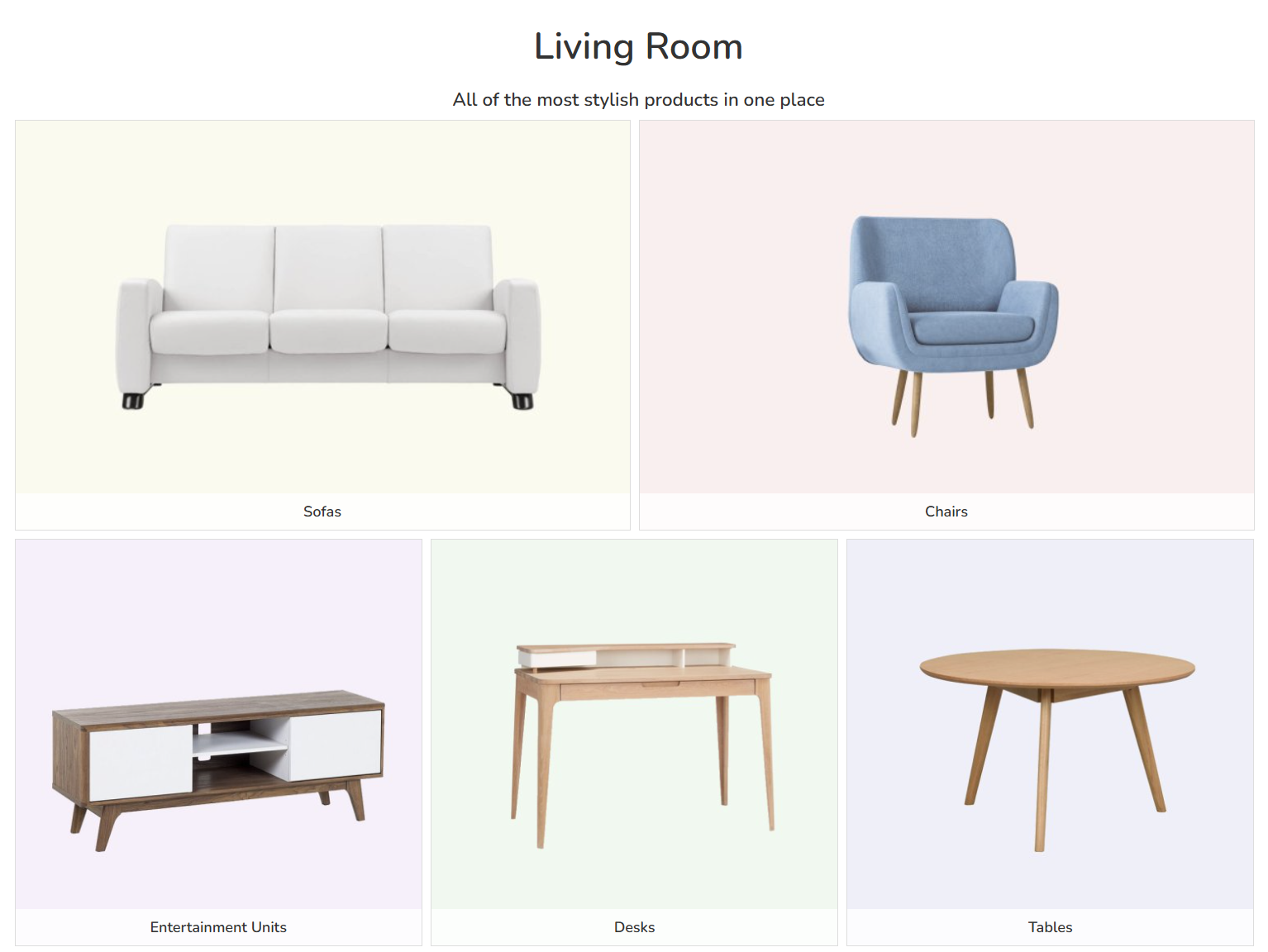
By default, sub categories will be shown on Product Listing Pages as their tiles. Images and image widths can be controlled when editing the sub category itself.

[![image.png](https://bookstack.iconography.co.uk/uploads/images/gallery/2026-06/scaled-1680-/image.png)](https://bookstack.iconography.co.uk/uploads/images/gallery/2026-06/image.png)
### Pill Buttons

Sub categories can also be displayed as pill buttons. These are ideal for minor categories and highly refined hierarchies.

This is controlled via the edit Category screen.

The sub category name will be used as the label for the pill button, unless the category short name is used; if it is, that will be used instead.

[![image.png](https://bookstack.iconography.co.uk/uploads/images/gallery/2026-06/scaled-1680-/v3gimage.png)](https://bookstack.iconography.co.uk/uploads/images/gallery/2026-06/v3gimage.png)