Modular Blocks
- Summary
- Version Control
- Text Blocks
- Image
- Carousel
- Hero
- Parallax
- Callout
- Feature
- Multi-Feature
- Wide-Feature
- Products
- Video
- Enquiry Form
- Raw HTML
- Group
- Margin
- Padding
Summary
Version Control
Every Modular Page comes with version control.
These are intended to allow users to work on multiple versions of the page, either to make changes in draft before putting them live, or to have multiple versions for different purposes:
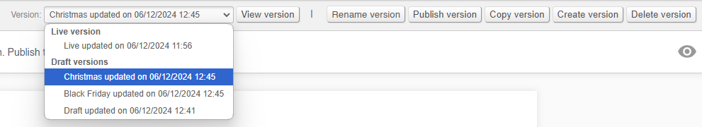
Although all changes to Modular Pages are instant, you will not see them on the website unless you are editing the live version
FAQs
How do I make a new version?
To make a new version, either copy and existing version, or alternatively user the control to create a new version from scratch.
How do I switch between versions?
Use the drop down and select a version, then click 'view version'.
How do I rename a version?
Use the 'rename version' button in order to rename the version.
You can only rename the version that you are currently viewing.
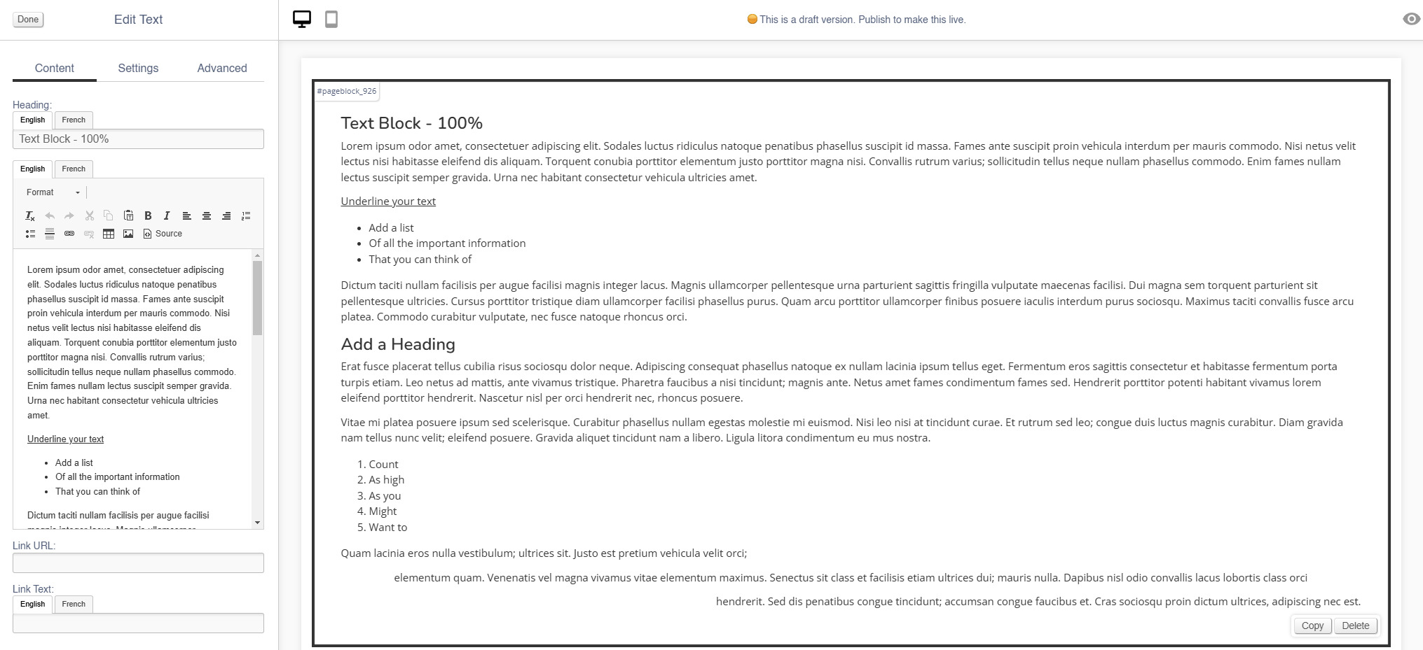
Text Blocks
Use this block to add large chunks of text to your page.
Appearance
Editing the Block
Content
| Field | Purpose |
| Heading | Enter a short block title - this will show above the main content of the block |
| Body Text | This is the main content of the block. Use the controls to format your text |
| Link URL |
Enter a link URL - if populated, this will add a call to action below the content of the block.
The position of this button can be controlled with the 'Link Position' control |
| Link Text |
Enter link text - if populated, this will change the text in a call to action below the content of the block
The position of this button can be controlled with the 'Link Position' control
If left blank, the button will read 'More' |
Settings
| Field | Purpose |
| Block Width |
Choose from:
|
| Visibility |
Set the block visibility from the list:
|
| Heading Position |
Alter the alignment of the block header:
|
| Link Position |
Alter the alignment of the link button:
|
Additional Options
| Field | Purpose |
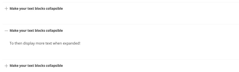
| Collapsible |
If set to yes, the whole Text block will be set as collapsible (see below)
Doing so will also adjust the Schema of the block; this will be flagged to search engines as an FAQ; the block Heading will be labelled as the question, and the Body Text as the answer |
Advanced
Padding
Adding padding will insert space within the current block; this will adjust the position of content within the block.
More information is available here.
Margin
The margin will add additional space around the current block.
More information is available here.
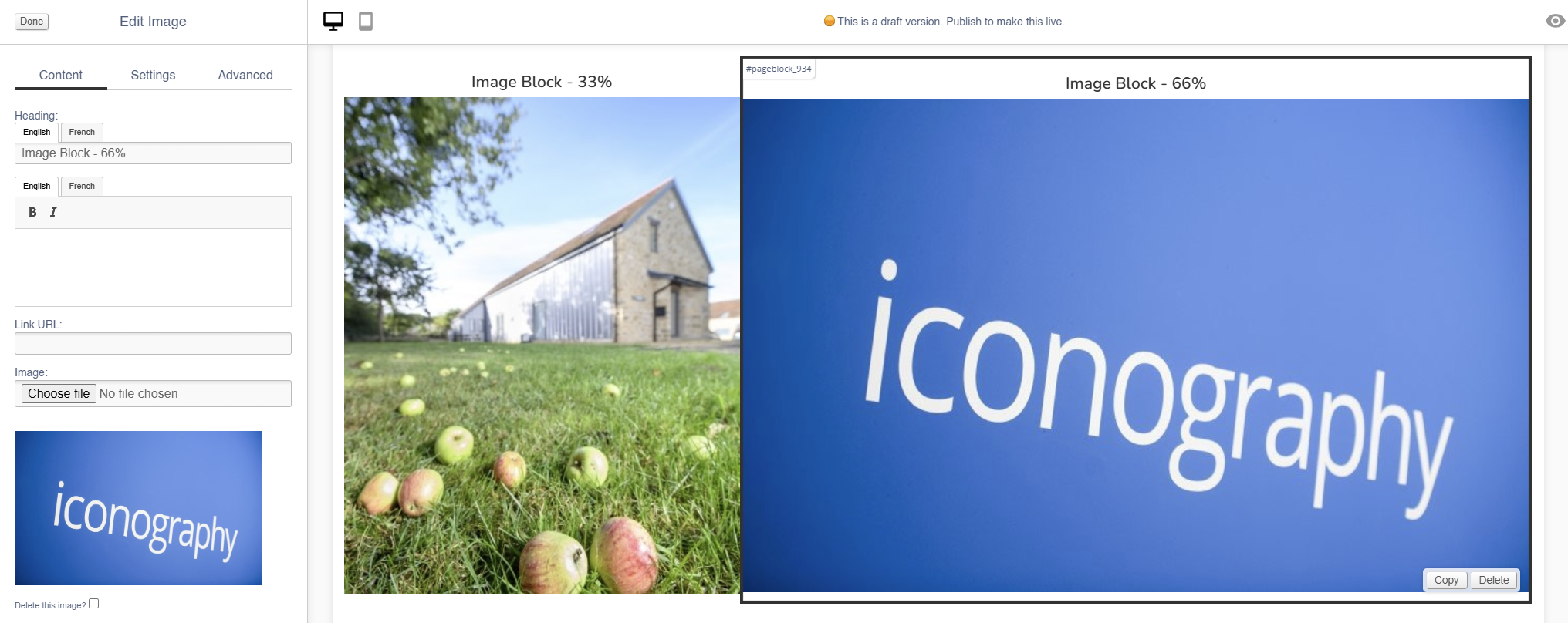
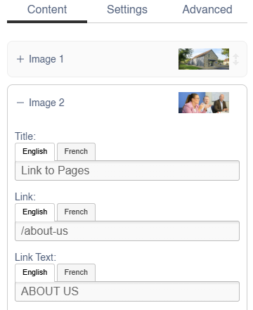
Image
Use this block to add simple images to your page.
There are also other blocks which can be used to add images:
- Carousel (small images on a swipeable carousel)
- Hero (large rotating banners)
- Parallax (an image that sits behind content, adding depth to a page)
- Feature (a styled image)
- Multi-Feature (multiple static images in a single block)
- Wide Feature (image with a block of text)
Appearance
Editing the Block
Content
| Field | Purpose |
| Heading | Enter a short block title - this will show above the main content of the block |
| Body Text |
This is the main content of the block. Use the controls to format your text
It will appear as a caption, below the image |
| Link URL | Enter a link URL - if populated, this will add a link to the image. |
| Image | Use the dialogue to select an image to upload |
| Alt Text |
Amend the Alt Text for the image |
| Delete Image | Use the tick box to delete an image - you will be asked to confirm your action |
Settings
| Field | Purpose |
| Block Width |
Choose from:
|
| Mobile Width |
Set the block width by selecting from the drop down:
|
| Visibility |
Set the block visibility from the list:
|
| Heading Position |
Alter the alignment of the block header:
|
| Background Colour | Choose a background colour for your image. Choose from recommended colours, or use a colour picker. |
Additional Options
| Field | Purpose |
| Invert Text Colour | Toggle to invert the text colour |
| Actual Size | Choose to display the image at actual size |
Advanced
Padding
Adding padding will insert space within the current block; this will adjust the position of content within the block.
More information is available here.
Margin
The margin will add additional space around the current block.
More information is available here.
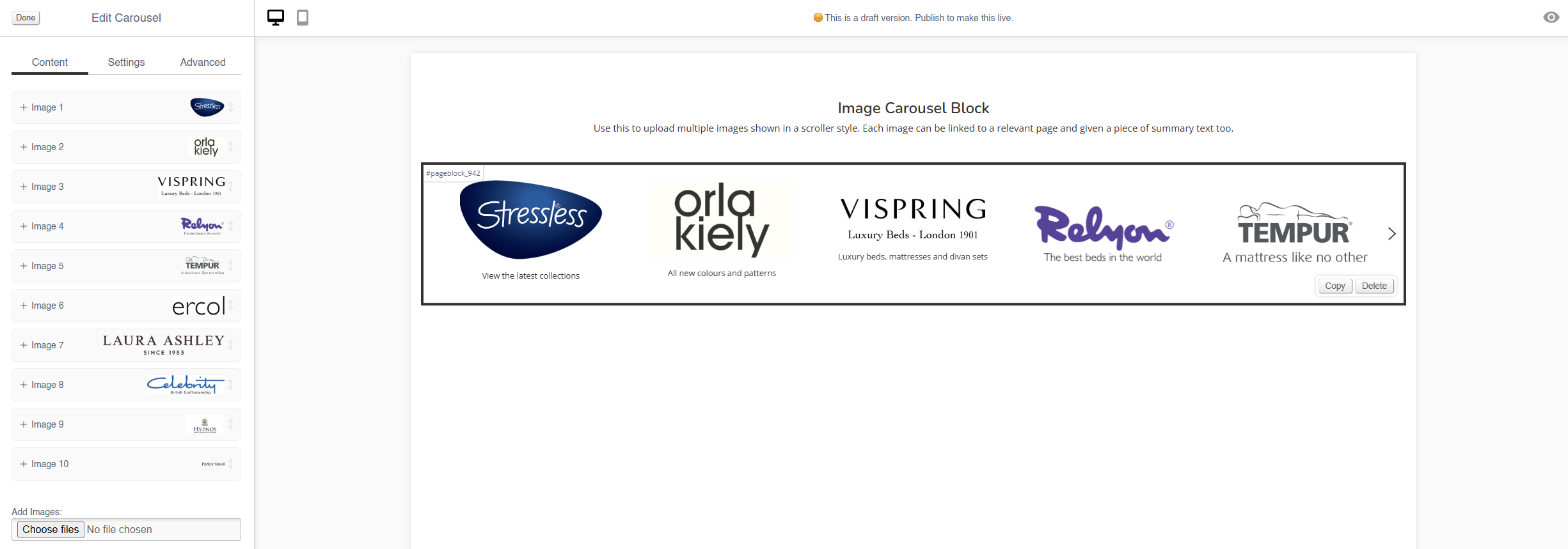
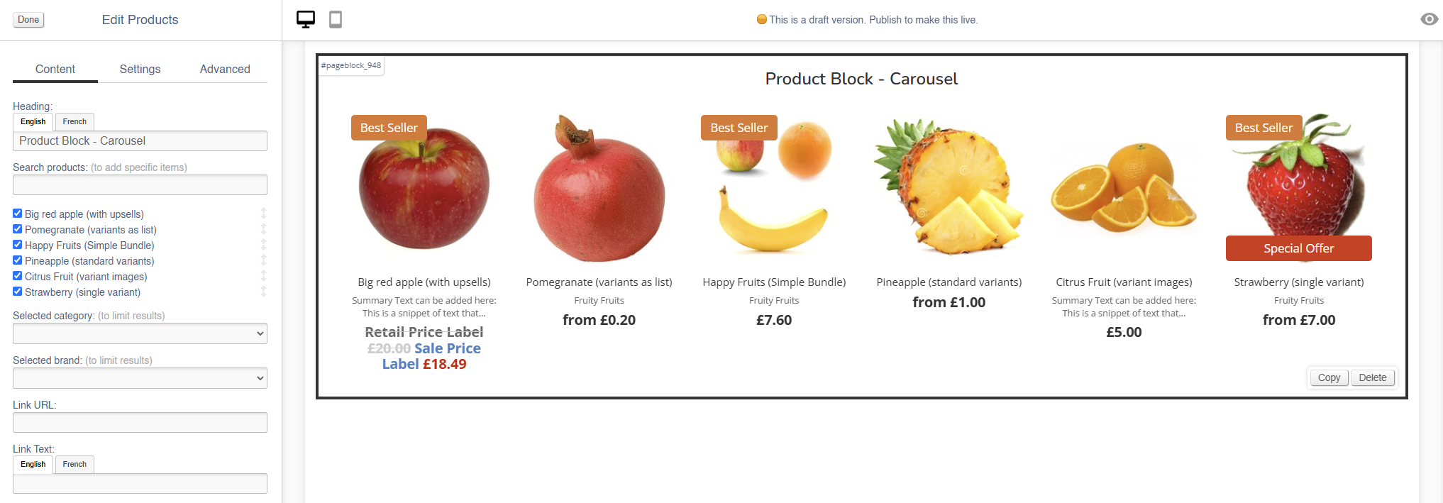
Carousel
Use this block to add small images on a swipeable carousel.
There are also other blocks which can be used to add images:
- Image (simple images)
- Hero (large rotating banners)
- Parallax (an image that sits behind content, adding depth to a page)
- Feature (a styled image)
- Multi-Feature (multiple static images in a single block)
- Wide Feature (image with a block of text)
Appearance
Editing the Block
Content
Each image has an expandable menu, allowing it to be edited individually.
Images may be dragged around to resequence them.
| Field | Purpose |
| Link URL | Enter a link URL - if populated, this will add a link to the image |
| Alt Text |
Amend the Alt Text for the image |
| Summary | Enter text that will be shown below the image |
| Delete Image | Use the tick box to delete an image - you will be asked to confirm your action |
Use the Image dialogue to select images to upload to this block.
Settings
Block width is not editable for the Hero block - it is always set to 100%.
| Field | Purpose |
| Visibility |
Set the block visibility from the list:
|
| Items Visible |
Defines how many images will be visible on page load |
| Items Visible (mobile) |
Defines how many images will be visible on page load when on a mobile device |
Additional Options
| Field | Purpose |
| Mouse Drag | Allow a user to mouse drag/swipe to scoll through the Carousel |
| Alt Style | Alters the amount of padding between each image within the block |
| Caption on Right? | Choose to show the Summary text below the image, or to the right of the image |
| Auto-play | Set the Carousel to auto scroll |
| Loop? | Set the auto scroll on a loop |
Advanced
Padding
Adding padding will insert space within the current block; this will adjust the position of content within the block.
More information is available here.
Margin
The margin will add additional space around the current block.
More information is available here.
Hero
Use this block to add large rotating banners with linked products.
There are also other blocks which can be used to add images:
- Image (simple images)
- Carousel (small images on a swipeable carousel)
- Parallax (an image that sits behind content, adding depth to a page)
- Feature (a styled image)
- Multi-Feature (multiple static images in a single block)
- Wide Feature (image with a block of text)
Appearance
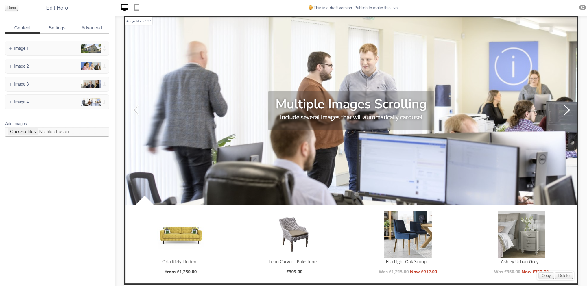
Editing the Block
Each image has an expandable menu, allowing it to be edited individually.
Images may be dragged around to resequence them.
Content
| Field | Purpose |
| Title | Enter a short title - this will be output as a text overlay, on top of the image |
| Link URL | Enter a link URL - if populated, this will add a link to the image. |
| Link Text |
Text to be shown with a button, if a link is set
If left blank, the whole image will act as a button |
| Additional Text | Enter some short text - this will be output as a text overlay, on top of the image below the title |
| Related Products |
Search for Products by name or SKU Code to link them to this hero image
They will display below the image
If you have multiple images in a Hero Block, the Products will change along with the image |
| Delete This Image? | Use this control to delete an image |
Use the Image dialogue to select images to upload to this block.
Settings
| Field | Purpose |
| Block Width |
Choose from:
|
| Visibility |
Set the block visibility from the list:
|
| Text Colour |
Choose from:
|
| Text Position |
Alter the alignment of the block text:
|
Additional Options
These options allow you to auto assign Products to Hero Images, without assigning specific Products.
| Field | Purpose |
| Allow header overlap | Allows for the creation of transparent headers |
| Include featured products | Auto add featured products to the images in this Hero block |
| Include recommended products | Auto add recommended products to the images in this Hero block |
| Include sale products | Auto add sale products to the images in this Hero block |
Advanced
Padding
Adding padding will insert space within the current block; this will adjust the position of content within the block.
More information is available here.
Margin
The margin will add additional space around the current block.
More information is available here.
Parallax
Use this block to add an image that sits behind content, adding depth to a page.
There are also other blocks which can be used to add images:
- Image (simple images)
- Carousel (small images on a swipeable carousel)
- Hero (large rotating banners)
- Feature (a styled image)
- Multi-Feature (multiple static images in a single block)
- Wide Feature (image with a block of text)
Appearance
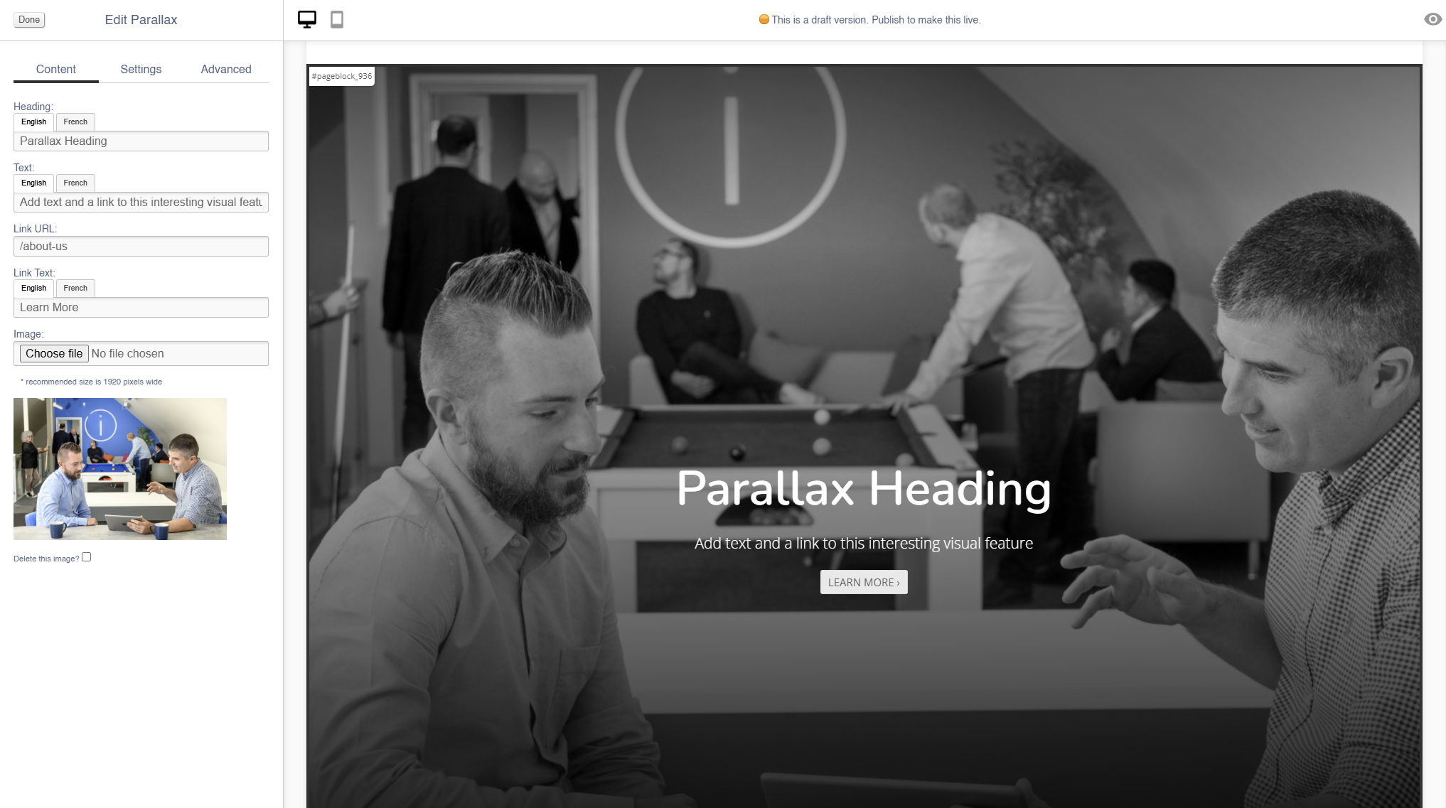
Editing the Block
Content
| Field | Purpose |
| Heading | Enter a short block title - this will show above the main content of the block |
| Text |
This is the main content of the block. Use the controls to format your text
It will appear as a caption, below the image |
| Link | Enter a link URL - if populated, this will add a link to the image. |
| Link Text |
Text to be shown with a button, if a link is set
If left blank, the whole image will act as a button |
| Delete Image | Use the tick box to delete an image - you will be asked to confirm your action |
Use the Image dialogue to select images to upload to this block.
Settings
| Field | Purpose |
| Block Width |
Choose from:
|
| Visibility |
Set the block visibility from the list:
|
| Text Position |
Alter the alignment of the block text:
|
| Text Colour |
Choose from:
|
Additional Options
| Field | Purpose |
| Full Screen | Toggle a large or small version of the parallax image |
| Box? | Toggle a box to surround the text |
| Filter? |
Toggle a filter on the image, which will make it darker if applied
This should be used to ensure high contrast between the image and overlaid text |
Advanced
Padding
Adding padding will insert space within the current block; this will adjust the position of content within the block.
More information is available here.
Margin
The margin will add additional space around the current block.
More information is available here.
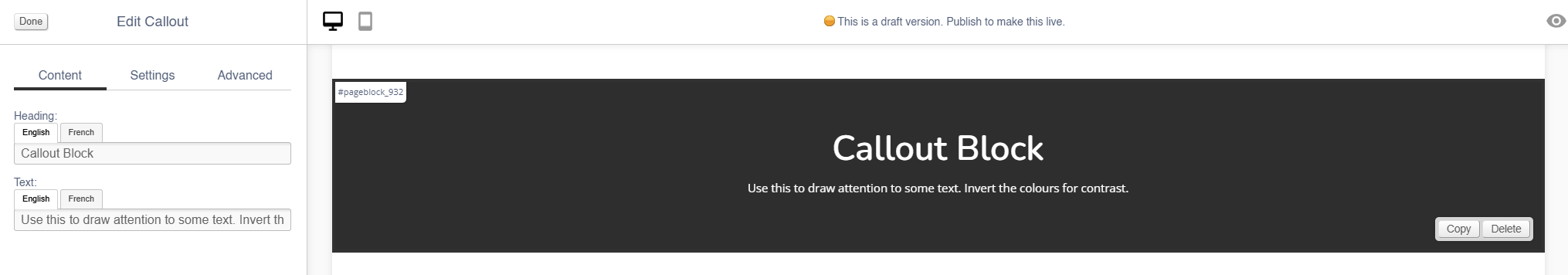
Callout
Use this to add small blocks of text with a coloured background.
Appearance
Content
| Field | Purpose |
| Heading | Enter a short block title |
| Text | This is the main content of the block. Use the controls to format your text |
Settings
| Field | Purpose |
| Block Width |
Choose from:
|
| Visibility |
Set the block visibility from the list:
|
| Background Colour | Choose a background colour for your image. Choose from recommended colours, or use a colour picker. |
Additional Options
| Field | Purpose |
| Invert text colour | Toggle to invert the text colour |
Advanced
Padding
Adding padding will insert space within the current block; this will adjust the position of content within the block.
More information is available here.
Margin
The margin will add additional space around the current block.
More information is available here.
Feature
Use this block to add a styled image.
There are also other blocks which can be used to add images:
- Image (simple images)
- Carousel (small images on a swipeable carousel)
- Hero (large rotating banners)
- Parallax (an image that sits behind content, adding depth to a page)
- Multi-Feature (multiple static images in a single block)
- Wide Feature (image with a block of text)
Appearance
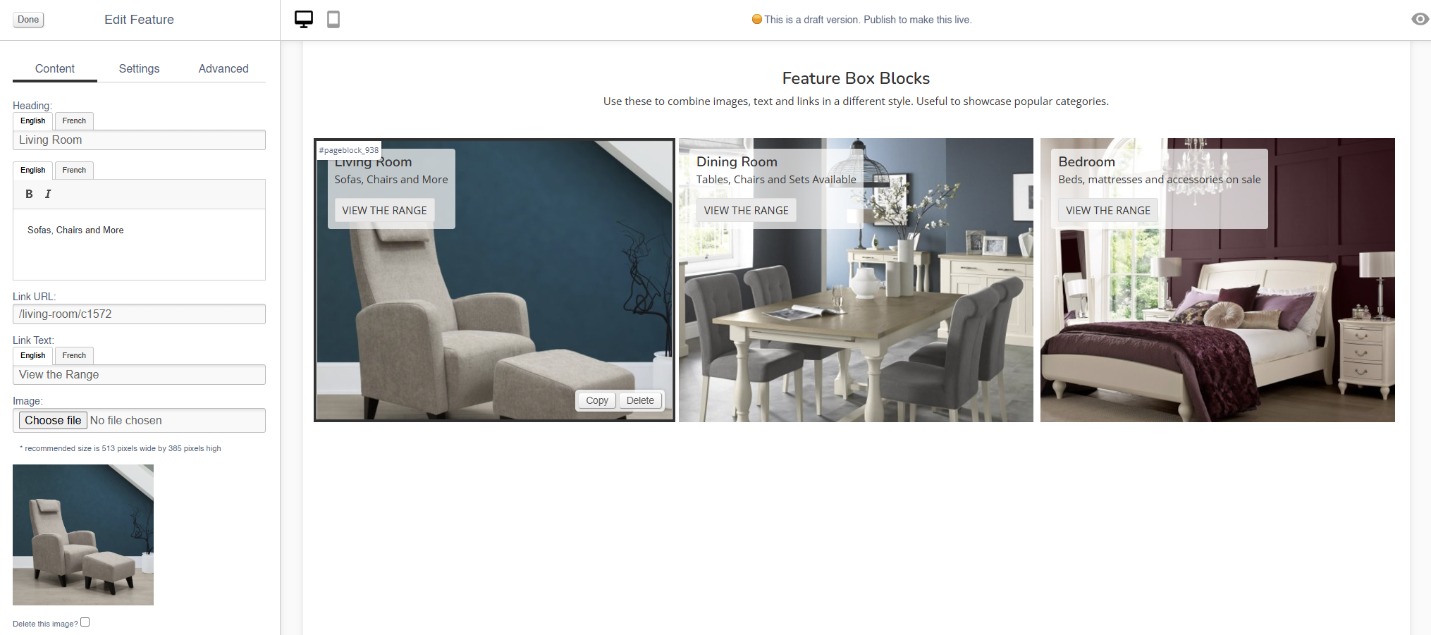
Editing the Block
Styling will be applied to this block as part of your website build - this will then remain constant across all pages.
Content
| Field | Purpose |
| Heading | Enter a short title - this will be output as a text overlay, on top of the image |
| Additional Text | Enter some short text - this will be output as a text overlay, on top of the image below the title |
| Link URL | Enter a link URL - if populated, this will add a link to the image. |
| Link Text |
Text to be shown with a button, if a link is set
If left blank, the whole image will act as a button |
| Delete This Image? | Use this control to delete an image |
Use the Image dialogue to select images to upload to this block.
Settings
| Field | Purpose |
| Block Width |
Choose from:
|
| Mobile Width |
Choose from:
|
| Visibility |
Set the block visibility from the list:
|
| Text Colour |
Choose from:
|
Additional Options
These options allow you to auto assign Products to Hero Images, without assigning specific Products.
| Field | Purpose |
| Text underneath | Output the text beneath the image, instead of over the image |
| Text central | Output the text centrally on the image |
| Do not crop to fit | Toggle to retain the aspect ratio of the image uploaded |
Advanced
Padding
Adding padding will insert space within the current block; this will adjust the position of content within the block.
More information is available here.
Margin
The margin will add additional space around the current block.
More information is available here.
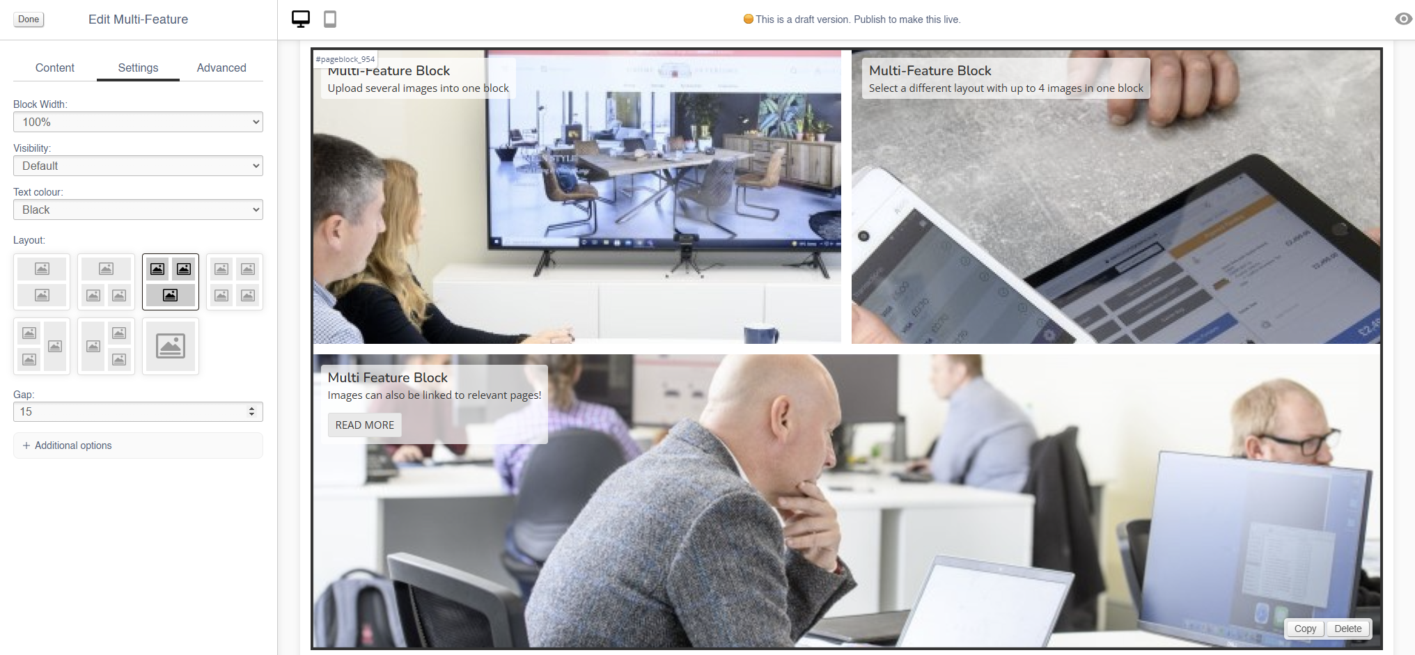
Multi-Feature
Use this block to add multiple static images in a single block.
There are also other blocks which can be used to add images:
- Image (simple images)
- Carousel (small images on a swipeable carousel)
- Hero (large rotating banners)
- Parallax (an image that sits behind content, adding depth to a page)
- Feature (a styled image)
- Wide Feature (image with a block of text)
Appearance
Editing the Block
To best configure this block, it is important to select your layout under Settings (see below) before you upload any images
Each image has an expandable menu, allowing it to be edited individually.
Content
| Field | Purpose |
| Heading | Enter a short title - this will be output as a text overlay, on top of the image |
| Text | Enter some short text - this will be output as a text overlay, on top of the image below the title |
| Alt Text |
Amend the Alt Text for the image |
| Link URL | Enter a link URL - if populated, this will add a link to the image. |
| Link Text |
Text to be shown with a button, if a link is set
If left blank, the whole image will act as a button |
| Delete This Image? | Use this control to delete an image |
Use the Image dialogue to select images to upload to this block.
Settings
| Field | Purpose |
| Block Width |
Choose from:
|
| Visibility |
Set the block visibility from the list:
|
| Text Colour |
Choose from:
|
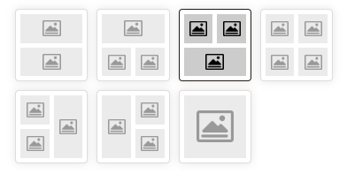
| Layout |
Use the control to select the layout - this may alter the number of images in this block
|
| Gap |
Choose the number of pixels between the images within this block |
Additional Options
These options allow you to auto assign Products to Hero Images, without assigning specific Products.
| Field | Purpose |
| Text central | Output the text centrally on the image |
Advanced
Padding
Adding padding will insert space within the current block; this will adjust the position of content within the block.
More information is available here.
Margin
The margin will add additional space around the current block.
More information is available here.
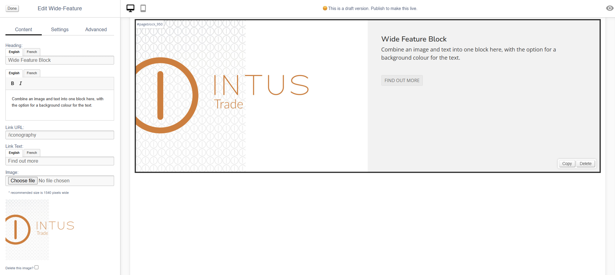
Wide-Feature
Use this block to add image with a block of text.
There are also other blocks which can be used to add images:
- Image (simple images)
- Carousel (small images on a swipeable carousel)
- Hero (large rotating banners)
- Parallax (an image that sits behind content, adding depth to a page)
- Feature (a styled image)
- Multi-Feature (multiple static images in a single block)
Appearance
Editing the Block
Content
| Field | Purpose |
| Heading | Enter a short title - this will be output as a text overlay, on top of the image |
| Additional Text | Enter some short text - this will be output as a text overlay, on top of the image below the title |
| Alt Text |
Amend the Alt Text for the image |
| Link URL | Enter a link URL - if populated, this will add a link to the image. |
| Link Text |
Text to be shown with a button, if a link is set
If left blank, the whole image will act as a button |
| Delete This Image? | Use this control to delete an image |
Use the Image dialogue to select images to upload to this block.
Settings
| Field | Purpose |
| Block Width |
Choose from:
|
| Visibility |
Set the block visibility from the list:
|
| Background colour |
Choose a background colour for your image
Choose from recommended colours, or use a colour picker |
Additional Options
These options allow you to auto assign Products to Hero Images, without assigning specific Products.
| Field | Purpose |
| Invert text colour | Toggle to invert the text colour |
| Do not crop to fit | Toggle to retain the aspect ratio of the image uploaded |
| Reverse layout | swap the position of the image and the text |
Advanced
Padding
Adding padding will insert space within the current block; this will adjust the position of content within the block.
More information is available here.
Margin
The margin will add additional space around the current block.
More information is available here.
Products
Use this to insert blocks of Products onto your page.
This will add live products to your page, so if any product data is updated, this page will also be automatically updated.
Disabled products are not shown within the block; add automated products to fill any gaps (see below for more details)
Appearance
Content
| Field | Purpose |
| Heading | Enter a short block title - this will show above the main content of the block |
| Search Product | Use this to search for specific products to display within this block |
| Selected Category |
Select a Category - this will filter automated Products
If left blank, no filter will be applied |
| Selected Brand |
Select a Brand - this will filter automated Products
If left blank, no filter will be applied |
| Link URL |
Enter a link URL - if populated, this will add a call to action below the content of the block. |
| Link Text |
Enter link text - if populated, this will change the text in a call to action below the content of the block
If left blank, the button will read 'More' |
Settings
| Field | Purpose |
| Block Width |
Choose from:
|
| Visibility |
Set the block visibility from the list:
|
| Heading Position |
Alter the alignment of the block header:
|
| Link Position |
Alter the alignment of the link:
|
| Display |
|
| Border Colour |
Choose from:
|
| Max Rows |
Select the maximum number of rows to appear:
|
Additional Options
These controls should be used in conjunction with the Category and Brand filters in the Content section
| Field | Purpose |
| Include featured products? | Auto add featured products to the images in this content block |
| Include home products? | Auto add products marked as 'home page featured' to this content block |
| Include recommended products? | Auto add recommended products to the images in this content block |
| Include hot this week products? | Auto add 'hot this week' products to this content block |
| Include most searched products? |
Auto add 'most searched' products to this content block |
| Include sale products? | Auto add sale products to the images in this content block |
Advanced
Padding
Adding padding will insert space within the current block; this will adjust the position of content within the block.
More information is available here.
Margin
The margin will add additional space around the current block.
More information is available here.
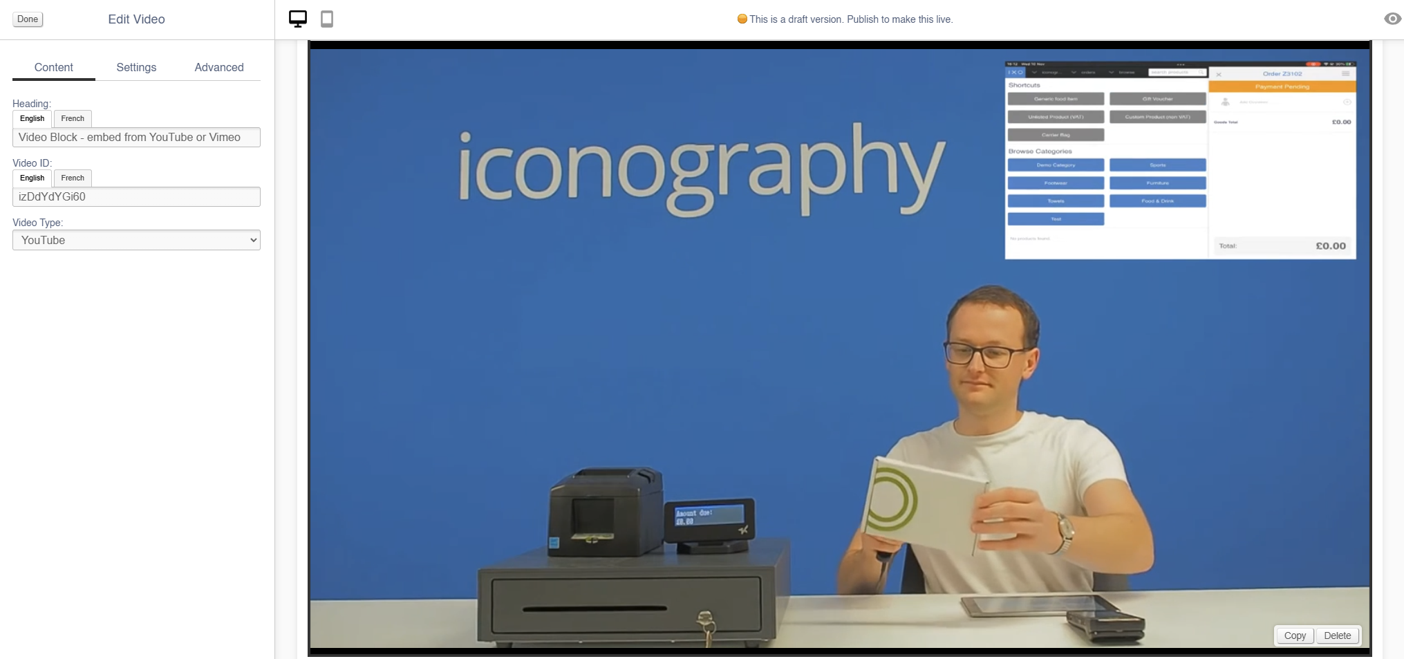
Video
Use this to add a video to your page.
Appearance
Editing the Block
Content
See here for more information about locating the Video IDs for Youtube and Vimeo.
| Field | Purpose |
| Heading | Enter a short block title - this will show above the main content of the block |
| Video ID | Enter the unique ID of the video you wish to add |
| Video Type |
Choose from:
|
Settings
| Field | Purpose |
| Block Width |
Choose from:
|
| Visibility |
Set the block visibility from the list:
|
| Heading Position |
Alter the alignment of the block header:
|
Additional Options
| Field | Purpose |
| Auto-play? | Toggle auto-play for the video (e.g. if the video automatically plays on page load) |
| Loop? | Toggle whether the video will or will not loop |
| Hide controls? | Hide player controls |
| Allow header overlap? |
Toggles whether the video shows behind the header, as per Hero banners
Important: User must also 'hide page title' to enable this |
| Portrait? | Toggle if this is a Portrait video, e.g. a Youtube Short |
Advanced
Padding
Adding padding will insert space within the current block; this will adjust the position of content within the block.
More information is available here.
Margin
The margin will add additional space around the current block.
More information is available here.
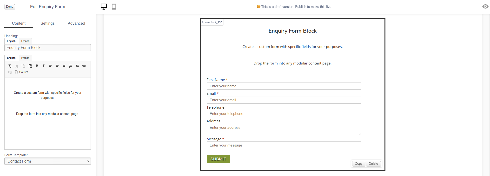
Enquiry Form
Use this to add an Enquiry Form to any page.
To use this content block, you must first have set up the Form that you wish to embed.
Appearance
Editing the Block
Content
| Field | Purpose |
| Heading | Enter a short block title - this will show above the main content of the block |
| Body Text | Enter some short text that will show above the form |
| Form Template | Select you Form Template from the list |
Settings
| Field | Purpose |
| Block Width |
Choose from:
|
| Visibility |
Set the block visibility from the list:
|
| Heading Position |
Alter the alignment of the block header:
|
Advanced
Padding
Adding padding will insert space within the current block; this will adjust the position of content within the block.
More information is available here.
Margin
The margin will add additional space around the current block.
More information is available here.
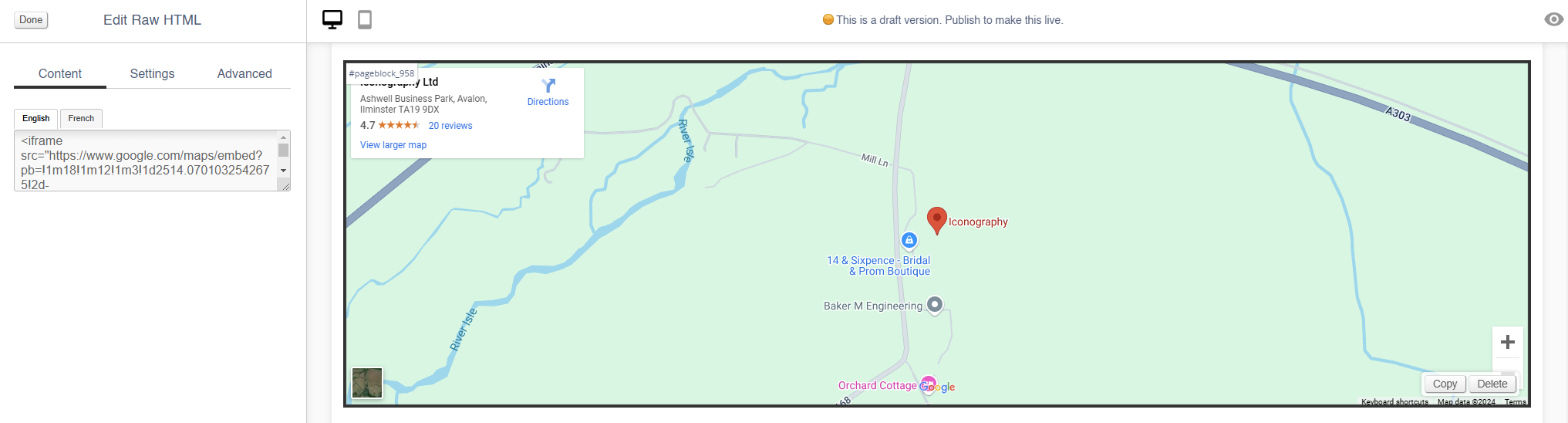
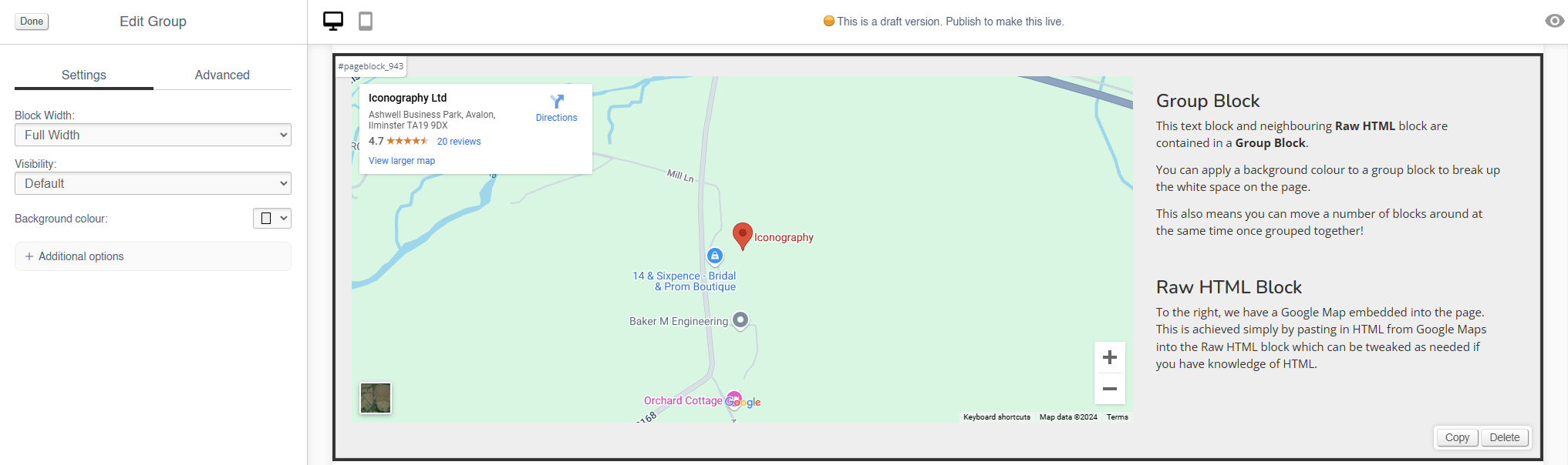
Raw HTML
Use this content block to embed raw HTML and third party code, e.g. for a Google Map.
When embedding a script or an iframe from a third party domain, it will be locked, unless that domain is on the permitted list.
Embedding third party code is risky and may cause harm to your website
You may have to contact Iconography prior to using these blocks, as third party domains will be blocked unless they have been whitelisted, e.g. for a Google Map
Appearance
Editing the Block
Content
| Field | Purpose |
| HTML | Paste your HTML into here |
Settings
| Field | Purpose |
| Block Width |
Choose from:
|
| Visibility |
Set the block visibility from the list:
|
Advanced
Padding
Adding padding will insert space within the current block; this will adjust the position of content within the block.
More information is available here.
Margin
The margin will add additional space around the current block.
More information is available here.
Group
Group blocks are used to create nested collections of blocks; they may also be given a background colour, allowing you to break up the appearance of a page.
Blocks may be moved within a group, or the block may be moved on the page, which will update move its contents too.
Adjusting a Group will adjust the blocks within it as well, e.g. reducing the width of the Group will make the blocks within it smaller, or changing the background colour of the Group will override the background colour of blocks within it.
To add a block to a Group, simply drag and drop it over the Group.
Appearance
Editing the Block
Settings
| Field | Purpose |
| Block Width |
Choose from:
|
| Visibility |
Set the block visibility from the list:
|
| Background Colour | Choose a background colour for your image. Choose from recommended colours, or use a colour picker. |
Additional Options
| Field | Purpose |
| Invert text colour | Toggle to invert the text colour |
| Content contained? | Toggle to contain the Content - this will affect the maximum width available to the content in the Group |
Advanced
Padding
Adding padding will insert space within the current block; this will adjust the position of content within the block.
More information is available here.
Margin
The margin will add additional space around the current block.
More information is available here.
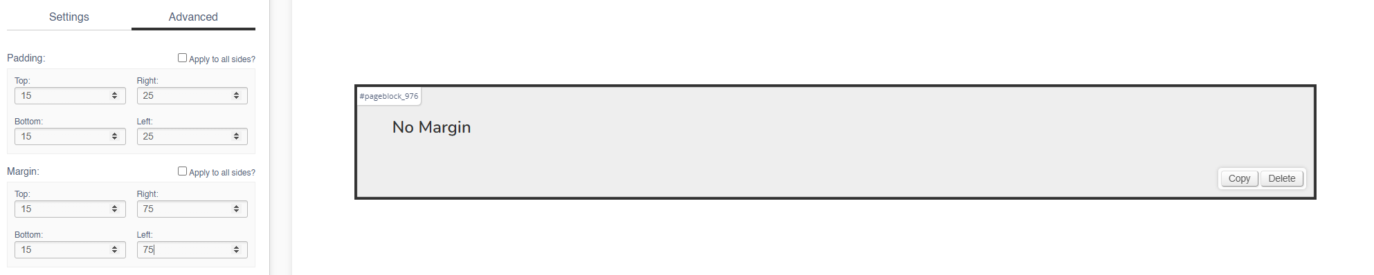
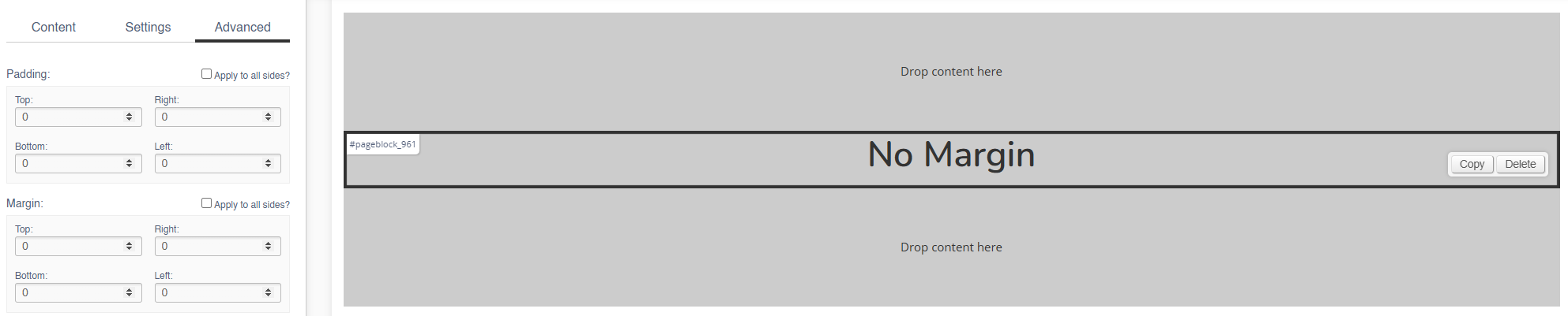
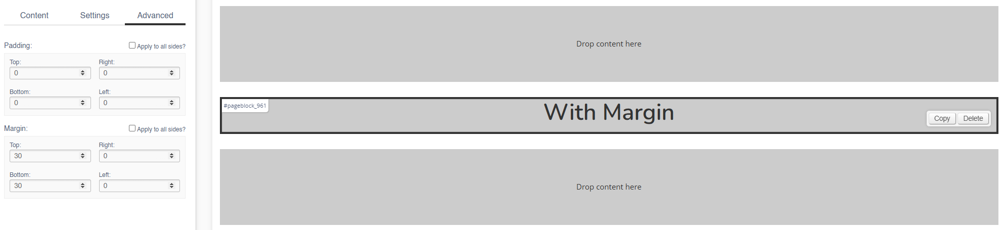
Margin
The margin will add additional space around the current block.
Margin (Left & Right)
No Margin
The block fills it's width (in this case, 100%).
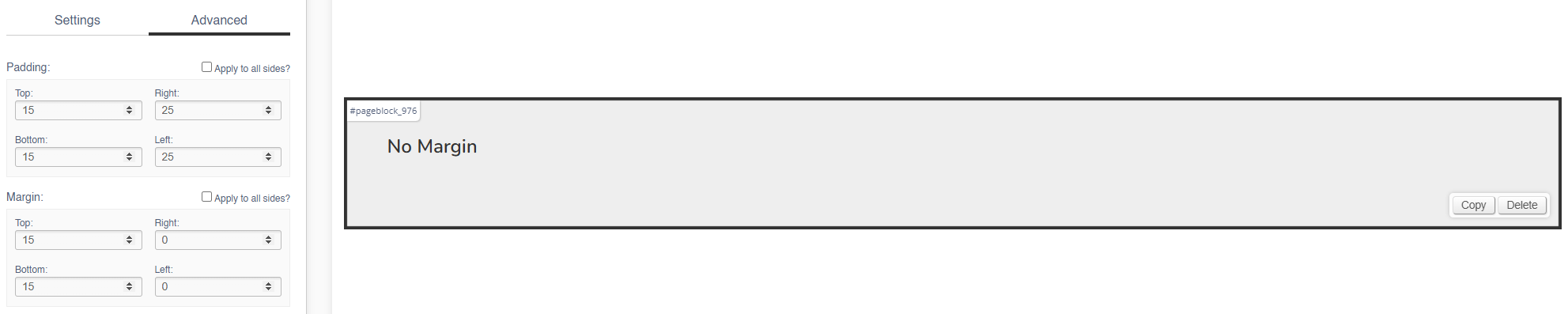
With Margin
The width of the block is reduced by the left/right margin (in this case, 75px).
Margin (Top & Bottom)
No Margin
The blocks are touching, with no gaps.
With Margin
There is now a gap between the blocks.
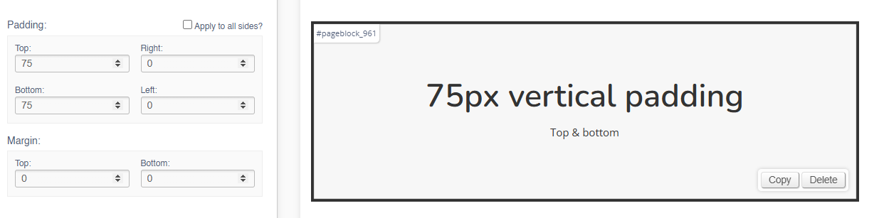
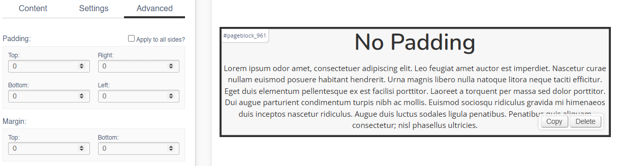
Padding
Adding padding will insert space within the current block; this will adjust the position of content within the block.
Padding (Left & Right)
Add left and right padding to indent the content.
No Padding
With Padding
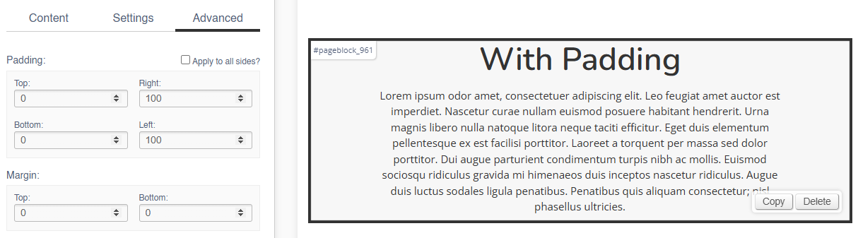
Padding (Top & Bottom)
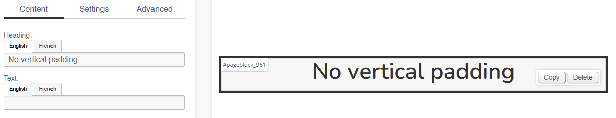
Adding padding to the top of bottom of the block will adjust the height of the block:
No Padding
With Padding