
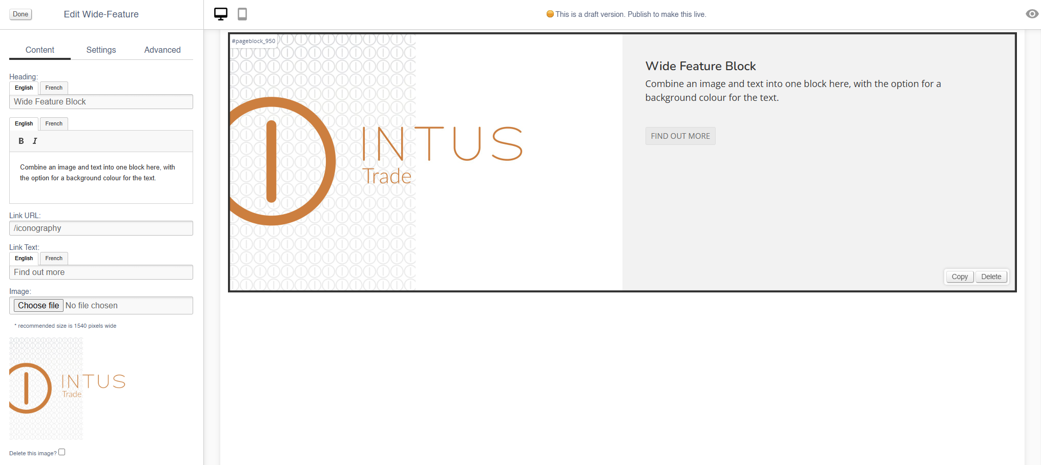
Wide-Feature
Use this block to add image with a block of text.
There are also other blocks which can be used to add images:
- Image (simple images)
- Carousel (small images on a swipeable carousel)
- Hero (large rotating banners)
- Parallax (an image that sits behind content, adding depth to a page)
- Feature (a styled image)
- Multi-Feature (multiple static images in a single block)
Appearance
Editing the Block
Content
| Field | Purpose |
| Heading | Enter a short title - this will be output as a text overlay, on top of the image |
| Additional Text | Enter some short text - this will be output as a text overlay, on top of the image below the title |
| Alt Text |
Amend the Alt Text for the image |
| Link URL | Enter a link URL - if populated, this will add a link to the image. |
| Link Text |
Text to be shown with a button, if a link is set
If left blank, the whole image will act as a button |
| Delete This Image? | Use this control to delete an image |
Use the Image dialogue to select images to upload to this block.
Settings
| Field | Purpose |
| Block Width |
Choose from:
|
| Visibility |
Set the block visibility from the list:
|
| Background colour |
Choose a background colour for your image
Choose from recommended colours, or use a colour picker |
Additional Options
These options allow you to auto assign Products to Hero Images, without assigning specific Products.
| Field | Purpose |
| Invert text colour | Toggle to invert the text colour |
| Do not crop to fit | Toggle to retain the aspect ratio of the image uploaded |
| Reverse layout | swap the position of the image and the text |
Advanced
Padding
Adding padding will insert space within the current block; this will adjust the position of content within the block.
More information is available here.
Margin
The margin will add additional space around the current block.
More information is available here.