
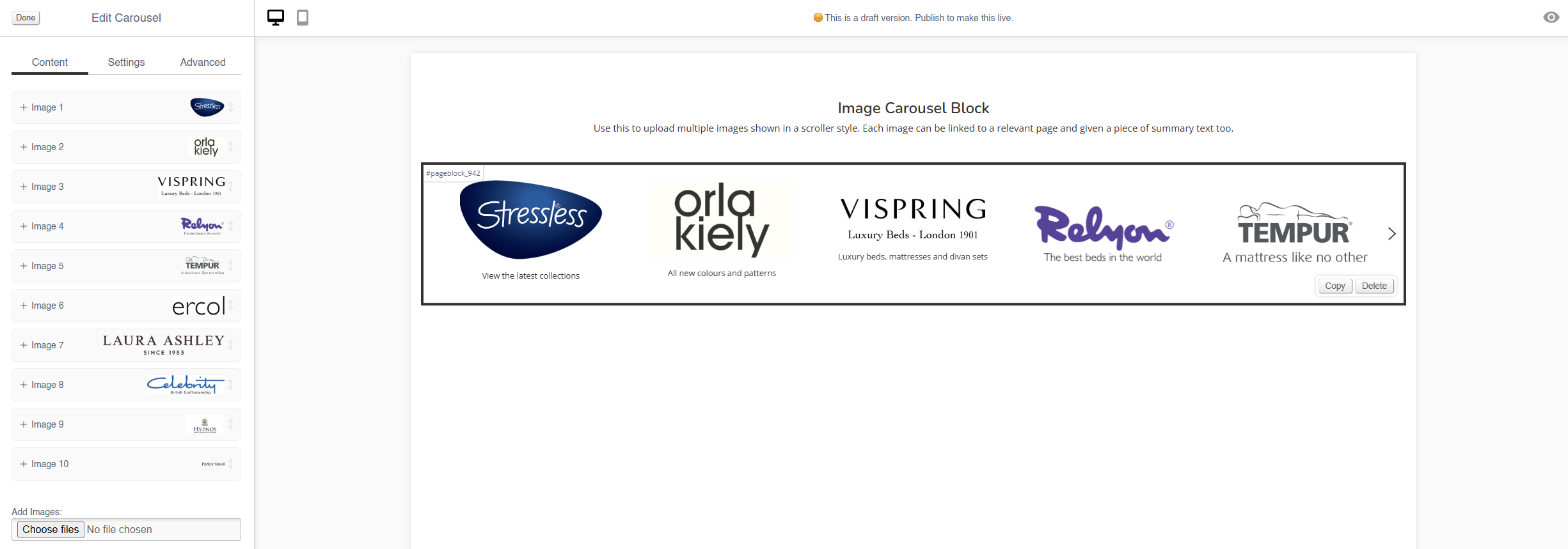
Carousel
Use this block to add small images on a swipeable carousel.
There are also other blocks which can be used to add images:
- Image (simple images)
- Hero (large rotating banners)
- Parallax (an image that sits behind content, adding depth to a page)
- Feature (a styled image)
- Multi-Feature (multiple static images in a single block)
- Wide Feature (image with a block of text)
Appearance
Editing the Block
Content
Each image has an expandable menu, allowing it to be edited individually.
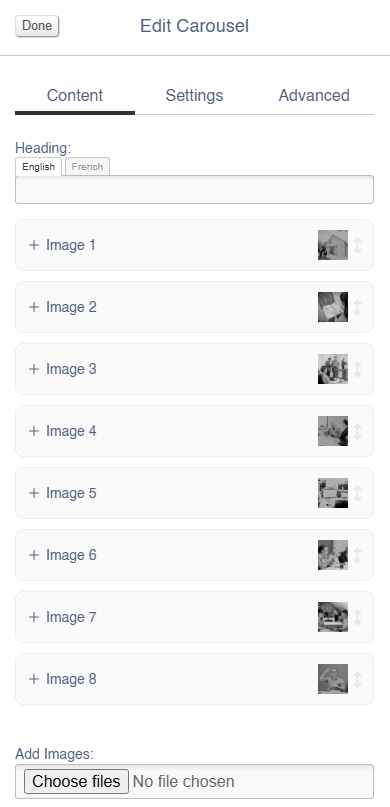
Images may be dragged around to resequence them.
| Field | Purpose |
| Link URL | Enter a link URL - if populated, this will add a link to the image |
| Alt Text |
Amend the Alt Text for the image |
| Summary | Enter text that will be shown below the image |
| Delete Image | Use the tick box to delete an image - you will be asked to confirm your action |
Use the Image dialogue to select images to upload to this block.
Settings
Block width is not editable for the Hero block - it is always set to 100%.
| Field | Purpose |
| Visibility |
Set the block visibility from the list:
|
| Items Visible |
Defines how many images will be visible on page load |
| Items Visible (mobile) |
Defines how many images will be visible on page load when on a mobile device |
Additional Options
| Field | Purpose |
| Mouse Drag | Allow a user to mouse drag/swipe to scoll through the Carousel |
| Alt Style | Alters the amount of padding between each image within the block |
| Caption on Right? | Choose to show the Summary text below the image, or to the right of the image |
| Auto-play | Set the Carousel to auto scroll |
| Loop? | Set the auto scroll on a loop |
Advanced
Padding
Adding padding will insert space within the current block; this will adjust the position of content within the block.
More information is available here.
Margin
The margin will add additional space around the current block.
More information is available here.