
Text Blocks
Use this block to add large chunks of text to your page.
Appearance
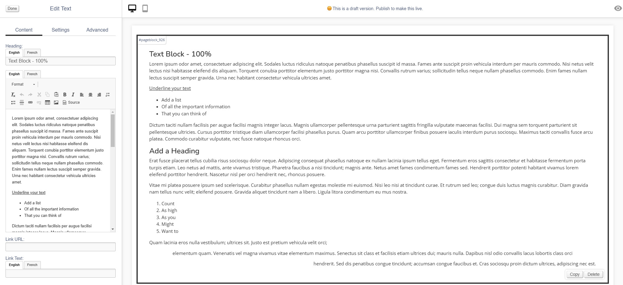
Editing the Block
Content
| Field | Purpose |
| Heading | Enter a short block title - this will show above the main content of the |
| Body Text | This is the main content of the block. Use the controls to format your |
| Link URL |
Enter a link URL - if populated, this will add a call to action below the content of the block.
The position of this button can be controlled with the 'Link Position' |
| Link Text |
Enter link text - if populated, this will change the text in a call to action below the content of the
The position of this button can be controlled with the 'Link Position'
If left blank, the button will read 'More' |
Settings
| Field | Purpose |
| Block Width |
|
| Visibility |
Set the block visibility from the list:
|
| Heading Position |
Alter the alignment of the block header:
|
| Link Position |
Alter the alignment of the link button:
|
Additional Options
| Field | Purpose |
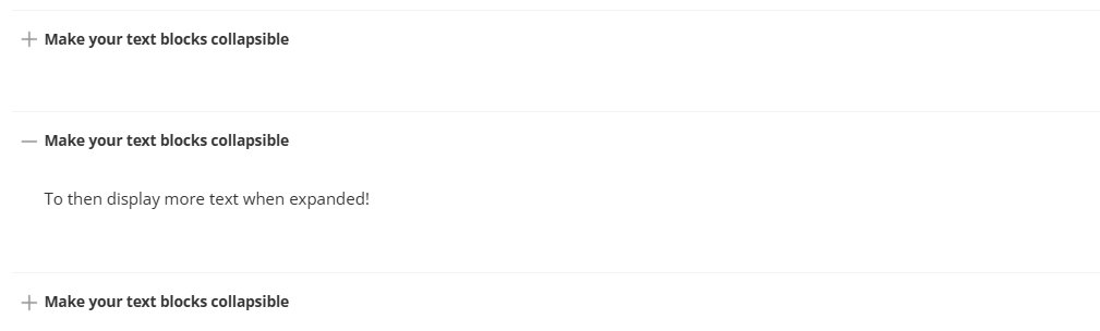
| Collapsible |
If set to yes, the whole Text block will be set as collapsible (see below)
|
Advanced
Padding
Adding padding will insert space within the current block; this will adjust the position of content within the block.
More information is available here.
Margin
The margin will add additional space around the current block.
More information is available here.