General
Utilities which appear throughout the system
- Stock Management
- Stock Reservation
- Cost Prices
- Stock Allocation
- Store Stock
- Stock Terminology
- Orphan Stock and Stock Matching
- Despatching Order Lines without Stock
- Documents
- Delivery Notes
- Picking List
- Product Labels
- Sales Order Invoices
- Shipping Labels
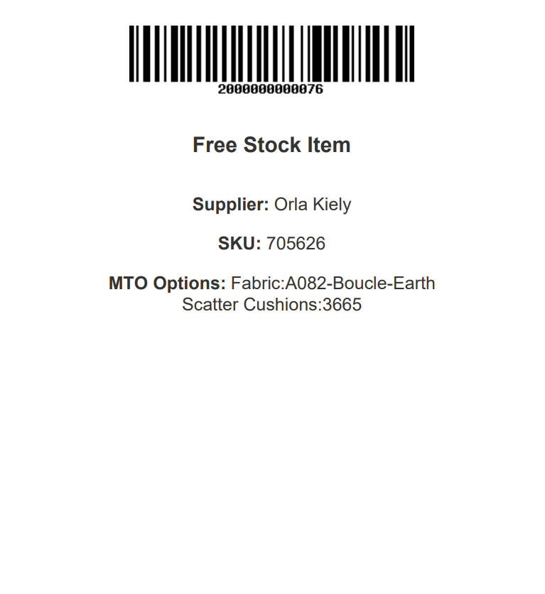
- Warehouse (Free Stock) Labels
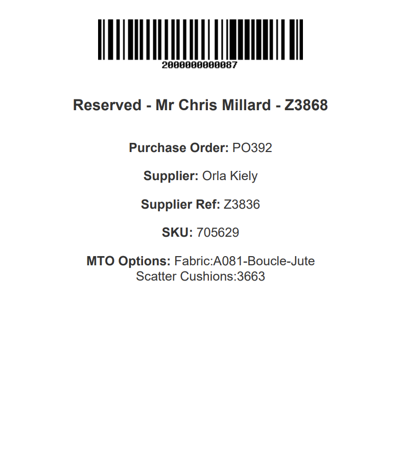
- Warehouse (Reservation) Labels
- Purchase Order PDF
- Bandwidth
- Modular Blocks
- Summary
- Version Control
- Text Blocks
- Image
- Carousel
- Hero
- Parallax
- Callout
- Feature
- Multi-Feature
- Wide-Feature
- Products
- Video
- Enquiry Form
- Raw HTML
- Group
- Margin
- Padding
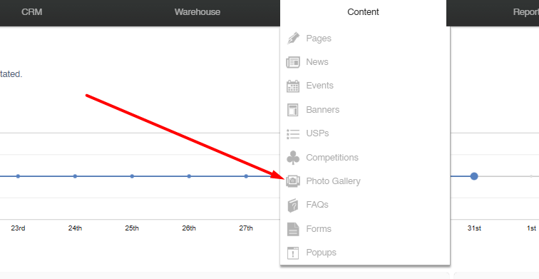
- Content
- Loyalty Scheme
- CMS
- Workflows
- Reporting
- CRM
- Sales Order Management
- Discontinued
- Products
Stock Management
Stock Reservation
Stock Reservation prevents automated processes from over-allocating a unit of stock
However, it is possible for a human to override this by manually selecting already reserved stock during Stock Allocation .
How Stock Reservation Works
Sales Orders
Stock which is allocated to a Sales Order line is always reserved to that Sales Order line.
Quotes
When creating a quote, the user will be asked if stock should be reserved for it. This stock will be reserved until the quote expires.
Draft Orders
Stock allocated to draft orders will never act as a reservation. If the user would like to reserve stock, the draft should be converted to an order.
eCommerce Baskets
Stock that is added to an eCommerce basket will be reserved for that basket for the duration of the user’s session. The reservation status will be automatically cleared one hour after the user becomes inactive.
Stock Locations
If a Stock Location is set toe 'reserved' then all stock in that location will be considered reserved, even though it is not linked to a Sales Order.
FAQs
What is Stock Reservation?
Stock Reservation is the process by which stock is reserved to Sales Orders.
How does this work with Purchase Orders?
A similar process is used with stock ordered via a Purchase Order.
Once stock has been ordered from a Supplier, and the stock has been
Can stock reservation be overridden?
Yes - it is possible to over allocate a single unit of stock. More information is available here.
Cost Prices
This page outlines the way in which Cost Prices are managed, both against individual units of stock, and directly related to Sales Orders.
The Basics
Cost prices are managed within the Variant Tab, and can also be amended within the CSV Import or by using the Price Management tool.
It is possible to set multiple Cost Prices for a single Variant if your system is enabled for Multiple Suppliers.
When stock is added to the system, it will be stored with a Cost Price. That will usually be based on the default Cost Price but may be adjusted in various ways (more detail below).
When fulfilling orders, IXO Commerce will always prioritise the oldest units of stock available.
Zero vs Null Cost Prices
When a product is created, the Cost Price will be set to 'null', unless a user actively amends it.
A 'null' Cost Price means that one has not been entered, and so IXO Commerce can not use it for any purpose. This includes, but is not limited to:
- calculating the total price of Purchase Orders (e.g. an error message will be shown)
- calculating the profit margin of an order (e.g. the unit of stock will be excluded, both as a revenue and as a cost)
- profit margin in reporting (e.g. the unit of stock will be excluded, both as a revenue and as a cost)
- stock holding (e.g. the unit of stock will be excluded from the report)
A 'zero' cost price of £0.00 must be manually entered. If it has been, this will be treated as an absolute value, and will therefore be used by the system as the Cost Price for that item. This includes, but is not limited to:
- calculating the total price of Purchase Orders
- calculating the profit margin of an order (e.g. that line would be 100% profit)
- profit margin in reporting (e.g. sales of that unit of stock would be 100% profit)
- stock holding (e.g. the stock holding for that unit of stock will be £0.00)
Stock Adjustments
Stock may be adjusted either through a Manual Stock Adjustment or via the Stock Take screen.
Manual Stock Adjustments
| Item | Details |
|---|---|
| Adjusting a Variant | When added, stock will be added to the system with a Cost Price that matches the default Cost Price for the Variant |
| Adjusting a Unique Stock Record | When added, stock will be added to the system with a Cost Price that matches the default Cost Price for the Unique Stock Record, if it is different to that stored against the linked Variant |
If your product is enabled for Multiple Suppliers and has multiple Cost Prices, when stock is added manually, IXO Commerce will use the lowest Cost Price as the default Cost Price.
Stock Take
| Item | Details |
|---|---|
| Stock Taking a Variant | When stock level is increased, stock will be added to the system with a Cost Price that matches the default Cost Price for the Variant |
| When stock level is decreased, stock will be deducted from the oldest stock records first | |
| Stock Taking a Unique Stock Record | When stock level is increased, stock will be added to the system with a Cost Price that matches the default Cost Price for the Unique Stock Record, if it is different to that stored against the linked Variant |
| When stock level is decreased, stock will be deducted from the oldest stock records first |
If your product is enabled for Multiple Suppliers and has multiple Cost Prices, when stock is added manually, IXO Commerce will use the lowest Cost Price as the default Cost Price.
Purchase Orders
When a Variant is added to a Purchase Order, that line is added at the default Cost Price set for that Variant.
If your product is enabled for Multiple Suppliers and has multiple Cost Prices, when a Variant is added to a Purchase Order, it will use the Cost Price linked to the Supplier attached to that Purchase Order.
Cost Prices may be amended within the Purchase Order.
If the cost price is changed on the purchase order after the stock has been received, it will update the cost price of the unit of stock.
The link to the purchase order is broken once the line has been despatched. If returned, the unit of stock will not be updated by changes against the purchase order.
Cost Prices and Sales Orders
Cost Prices are linked to Sales Order Lines, and are used for margin reporting throughout IXO Commerce.
Default Function
| Item | Details |
|---|---|
| Variants | By default, it takes the cost price of the variant as it was at the time the order was created. |
| If the default cost price of the variant changes, it does not affect existing sales orders. | |
| Unique Stock Records | If a Unique Stock Record exists and has been selected when creating the order, the default cost price of the Unique Stock Record will override the variant cost. |
Existing Stock
| Item | Details |
|---|---|
| Stock Assignment | If stock is assigned from a warehouse/stock location, it will take the cost price from the oldest unit of stock within that location. |
| If the order line is for more than one item, the oldest items in that location are allocated to that order line, producing an average cost price. | |
| The average cost price is calculated from the costs of the allocated units, as only one cost price can be stored per sales order line. |
Purchase Orders
| Item | Details |
|---|---|
| Order Line Allocation | If the order line is allocated/linked to a purchase order, the cost price on the purchase order will override the default cost price. |
| Goods In | When the stock item on the purchase order is received, a new unit of stock is created with a cost price that matches the purchase order. This item is then automatically allocated to the Sales Order. |
| Changes to Purchase Order | If the cost price is changed on the purchase order after the stock has been received, it will update the cost price of the unit of stock and, subsequently, the Sales Order. |
Practical Examples
Example 1: Assigning Sales Orders
- Order Creation:
- Variant "Widget A" has a default cost price of £10.00.
- Sales order created on 01/01/2024 uses this cost price.
- If the cost price of "Widget A" changes to £12.00 on 02/01/2024, the sales order from 01/01/2024 still uses £10.00.
- Unique Stock Record:
- Unique Stock Record for "Widget A" has a cost price of £11.00.
- When creating the sales order, this record is selected.
- The cost price for the sales order line is £11.00, overriding the variant’s default price.
Example 2: Existing Stock
- Stock Assignment:
- Warehouse location "Main" has 3 units of "Widget A" with cost prices £10.00, £11.00, and £12.00 (oldest to newest).
- Sales order line requests 2 units of "Widget A".
- The system assigns the two oldest units (cost prices £10.00 and £11.00).
- The average cost price for the sales order line is £10.50.
Example 3: Purchase Orders
- Linking to Purchase Order:
- Purchase order for "Widget A" has a cost price of £13.00.
- Sales order line is linked to this purchase order.
- The cost price for the sales order line is £13.00, overriding the default cost price.
- Changes and Despatch:
- Cost price on the purchase order is changed to £14.00 after receiving stock.
- The new cost price of £14.00 updates the unit of stock and the sales order.
- Once the sales order line is despatched, it no longer updates from the purchase order.
Example 4: Stock Adjustments
- Variant "Gadget B" has a default cost price of £15.00.
- On 03/01/2024, 5 units of stock are manually added via a Stock Adjustment.
- These units are now in the system at the cost price of £15.00, matching the default cost price at time of the Stock Adjustment.
Example 5: Stock Take
- Warehouse "North" has 10 units of "Gadget C" with varying cost prices.
- During a stock take, it is discovered that 2 units are damaged and removed from the system.
- The system deducts the 2 oldest units first, adjusting the average cost price accordingly.
Example 6: Multiple Suppliers
- Variant "Tool D" has cost prices from Supplier A (£20.00) and Supplier B (£18.00).
- A purchase order is created with Supplier B, setting the cost price to £18.00.
- When stock is manually added, the system uses the lowest cost price, which is £18.00.
FAQs
What happens if the stock is returned after despatch?
The link to the purchase order is broken once the line has been despatched. If returned, the unit of stock will not be updated by changes against the purchase order.
How do I view the cost price history of a variant?
Stock Allocation
Overview
Stock Allocation is the process by which a unit of stock is added to a Sales Order. This process can be manual or automated.
Stock Allocation is powered by Store Stock and Purchase Orders.
Automated Stock Allocation
If automated, IXO Commerce will allocate stock based on proximity and age. It will prioritize stock from the selling Store (e.g., the Store in which the Sales Order was created), and will always allocate the oldest units first.
If there is no stock available in the selling store, IXO Commerce will allocate stock from other stores, if available. Stock will be allocated from the location with the most available stock, although other settings at the Store and Location level may override this.
If there is not enough physical stock in the business, IXO Commerce will attempt to allocate stock from open purchase orders, if there is free stock on a purchase order.
If there is insufficient stock available (either in the business or in open purchase orders), then the order will fall into ‘unallocated’ and manual intervention will be required.
At minimum, the auto-allocation process will run hourly.
Manual Stock Allocation
Manual assignment can either be done within the POS or from the Sales Order edit screen. The function is similar in both, but in the POS, it is not possible to split stock or to create new purchase orders.
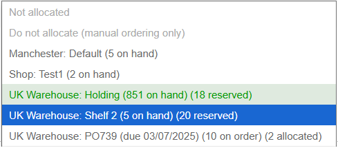
Units of stock are displayed per Location/Purchase Order, with clear indicators for quantities On Hand/Reserved/On Order/Allocated.
For definitions on these terms, please see Stock Terminology.
POS Allocation
To allocate a line within the POS, the user must click or tap on the line item. This will open the edit item pop-up, and stock may be allocated using the drop-down.
Sales Order Edit Screen Allocation
To allocate a line within the Sales Order edit screen, the user simply uses the drop-down against the relevant Sales Order line.
Allocation Options
A user may either:
- Leave the line as ‘not allocated’ (this will trigger automated allocation processes) and flag the Sales Order Line to be shown in Required Orders if it meets the other criteria
- Mark the line as ‘do not allocate’ (this will prevent automated allocation processes) and flag the Sales Order Line to be shown in Required Orders if it meets the other criteria
- Allocate existing stock from a location by choosing a location
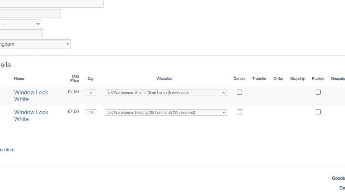
- If there is not enough stock in the location for a line, e.g., 5 are needed and location A only has 2, then a split stock button will appear. This will allow the user to split the line, so that the first part is fulfilled from location A, and the second part can be allocated separately
- Create a new purchase order using the tick box to the right of the drop-down. That will create a new back-to-back purchase order linked to this Sales Order line.
- New purchase orders may also be created from the Required Orders screen
- Stock Reservation prevents automated processes from over-allocating a unit of stock
However, it is possible for a human to override this by manually selecting already reserved stock during Stock Allocation.
Overallocation
A Sales Order Line may become overallocated for a variety of reasons. These include (but are not limited to):
- a stock take has reduced the amount of stock available in an allocated location
- a user has manually over allocated multiple orders to the same stock location
- fewer units than expected were received via a Purchase Order
It may also be that there is a Sales Order Line that can not be allocated as the quantity required is larger than the quantity available in any given stock location; for order lines like this, it may be necessary to treat it as an overallocation
Resolving Overallocation
This can be achieved via the Split Stock button on the Sales Order page:
1. This order is overallocated

2. Click "Split stock"

3. This will split the problematic Sales Order Line into two lines; this will retain the same price, date added, etc., in order to maintain reporting integrity
4. The lines will still be allocated to the same Stock Location, so you will need to change this using the Allocation drop down

5. Choose your new Location/Purchase Order

6. Click "Update items"

7. Repeat these steps if necessary
8. This will have resolved the stock overallocation
FAQs
How does automated Stock Allocation work?
IXO Commerce allocates stock based on proximity and age. It prioritizes stock from the selling Store and allocates the oldest units first.
Can I rely solely on automation?
No, if there is insufficient stock available, the order will fall into ‘unallocated’ and manual intervention will be required.
Is it possible to over allocate?
Yes - within the CMS a user may assign the same unit of stock to multiple Sales Order Lines. This will result in over allocation (see above).
Store Stock
Stores and Locations
In IXO Commerce, stock is managed at the Store level, with each Store potentially having multiple Locations.
Each Location can be set to one of the following statuses:
- Available: Stock is available for order fulfillment.
- Unavailable: Stock is not available for Sales Order fulfillment (typically used for damaged stock).
- Reserved: Stock is reserved and cannot be used for Sales Order fulfillment.
Units of Stock
For each item (e.g., a Variant or a Unique Stock Record), there may be multiple units of stock. These units are organized by:
Date Received: When the stock was added to the system (typically the date it was received on a Purchase Order)
Cost Price: The cost to associated with that unit of stock.
This allows for multiple units of the same item to have different cost prices and dates of receipt.
Adding Units of Stock
Units of stock can be created through:
- Manual adjustments
- Stock take
- Purchase ordering
Removing Units of Stock
Units of stock can be removed through:
- Manual adjustments
- Stock take
- Supplier returns
- Sales Order fulfillment
Practical Examples
Example 1: Multiple Units of Stock
- Storing the age of a unit of stock:
- Variant “Gadget A” has 5 units of stock in the Bristol Store
- 2 units were received on the 01/05/2024
- 3 units were received on the 24/02/2024
- Storing different Cost Prices:
- Variant ‘small-pink-shirt’ has 5 units of stock in the London Store
- 1 is stored at a Cost Price of £5
- 3 are stored at a Cost Price of £6.50
- 1 is stored at a Cost price of £7
- Total value of the stock holding is £31.50
Example 2: Stock Adjustments
- Variant "Gadget B" has a default cost price of £15.00.
- On 03/01/2024, 5 units of stock are manually added via a Stock Adjustment.
- These units are now in the system at the cost price of £15.00, matching the default cost price at time of the Stock Adjustment.
Example 3: Stock Take
- Warehouse "North" has 10 units of "Gadget C" with varying cost prices.
- During a stock take, it is discovered that 2 units are damaged and removed from the system.
- The system deducts the 2 oldest units first, adjusting the average cost price accordingly.
FAQs
Can I have units of stock with multiple cost prices for the same item?
Yes, IXO Commerce allows you to manage multiple units of the same item with different cost prices and dates of receipt. This helps in accurate cost tracking and inventory management.
Will units of stock be linked to Purchase Orders?
Yes, if a unit of stock was ordered and received as part of a Purchase Order, the Purchase Order Id will be stored alongside the cost price and date or receipt.
What happens if stock units have different dates of receipt?
IXO Commerce allows you to track the date each unit of stock was received, which helps in identifying the age of your stock and managing stock rotation effectively.
Stock Terminology
Current Stock
This list applies to units which are currently in the business. These terms are used throughout the CMS and the POS.
| Label |
Purpose |
| Stock |
Total number of units in the business
Includes Available, Reserved and Unavailable |
| On Hand |
Number of units held at the current Store
Includes Available, Reserved and Unavailable |
| Available |
Number of units available for Sales Order fulfilment in the User's current Store
This equals On Hand minus Reserved and Unavailable |
| Reserved |
Number of units Reserved to Sales Orders and eCommerce baskets
Includes all Sales Order lines which have not been despatched, and excludes orders with the following statuses:
Also includes units of stock in locations marked as 'Reserved' |
| Unavailable |
Unavailable units, typically damaged or undergoing quality control
Number of units held in locations marked as 'Unavailable' |
| Available Elsewhere | Number of Available units elsewhere in the business, e.g. the total amount of Available units in other Stores |
Purchase Orders
This list applies to units which are currently on order from a Supplier. These terms are used throughout the CMS and the POS.
| Label | Purpose |
| On Order |
Total number of units ordered from the Supplier
Typically, this is in relation to the total number of units ordered from a Supplier on a particular Purchase Order
This equals 'Allocated' plus 'Unallocated' |
| Allocated |
Total number of units on a Purchase Order allocated to Sales Order lines
This equals 'On Order' minus 'Unallocated'
This figure includes units on 'Locked' Purchase Orders |
| Unallocated |
Total number of units on a Purchase Order that are free to be allocated
This equals 'On Order' minus 'Allocated'
Units on a 'Locked' Purchase Order will be excluded from 'Unallocated' |
POS
This list includes labels which are only used within the POS.
| Label | Purpose |
| Available to order | Signifies that there are no units of the SKU within the business, and that there are none on order - fulfilment of a new Sales Order will only be possible following a Purchase Order |
| Backorder lead time is xxx days | Displays the default lead time for the SKU |
eCommerce
This list includes labels which are only used within the eCommerce website.
| Label | Purpose |
| In Stock |
Signifies that there are units available in the business, and that a new Sales Order may be immediately fulfilled
An 'In Stock' figure is made up of the total number of Available units in Locations across all Stores enabled for web fulfilment. |
| Out of Stock |
Signifies that there are no units available in the business, and that a new Sales Order may be will not be fulfilled
An 'Out Of Stock' figure is determined by checking the total number of Available units in Locations across all Stores enabled for web fulfilment. |
| Available (allow XXX days for delivery) | Displays the default lead time for the SKU |
| Low Stock |
Signifies that there are only a small number of Available units
Triggered if the number of 'In Stock' units is less than the 'Low Stock (order at)' figure on the Inventory tab |
| Available to pre-order |
Signifies that stock is coming into the business, which will be used to fulfil a new Sales Order
The appropriate lead time will be displayed in the checkout
Only displays if 'allow back order' is not enabled
Total number of units available to pre-order equals the total amount of 'unallocated' units for that SKU across all Purchase Orders |
Orphan Stock and Stock Matching
Orphan Stock
Orphan stock occurs when a unit of stock becomes disassociated from its original purchase order. This can happen in several ways, such as manual stock adjustments made through the inventory screen or the addition of new stock during a Stock Take. Another common issue arises when non-existent stock is dispatched—if that stock is later returned, it remains unlinked to any purchase order, further complicating inventory tracking.
Orphan Stock Cost Price
Whenever units of Orphan Stock are created, they will inherit the default cost price for that Variant or Unique Stock Record.
Example 1
A customer has bought a Red Hat. There are no stock records for the Red Hat, but Bob has found one. He packs up the item and marks the order as despatched.
The Sales Order is not linked to a Purchase Order, so the true cost of the item is not known.
The Cost Price of the Variant as of today is £5.43, so £5.43 is recorded against the Sales Order and is used in margin reporting.
Example 2
In IXO Commerce, Shelf A has 5 Blue Hats that arrived on PO123 at £2.34 each.
During Stock Take, those are not found, and the stock is removed. At the same time, Shelf B is found to have 5 Blue Hats, so these are added.
If there was no link to another stock record, those new ones would be added at today's cost price of £3.45.
Automated Stock Matching will automatically resolve this problem (see below)
Stock Matching
IXO Commerce will attempt to match Orphan Stock Records as best it can, in order to reduce their number. This will occur in a few specific cases:
- If adjustments are made within a week of each other, for the same SKU
- If adjustments take place within the same store
If automatic Stock Matching is not possible, it will still be possible for a user to manually amend the Cost Price of Orphan Stock Records via the Inventory tab.
Example 1
A customer has bought a Red Hat. There are no stock records for the Red Hat, but Bob has found one. He packs up the item and marks the order as despatched.
The Sales Order is not linked to a Purchase Order, so the true cost of the item is not known.
The Cost Price of the Variant as of today is £5.43, so £5.43 is recorded against the Sales Order and is used in margin reporting.
There is no matching adjustment, so nothing can be matched automatically.
Example 2
In IXO Commerce, Shelf A has 5 Blue Hats that arrived on PO123 at £2.34 each.
During Stock Take, those are not found, and the stock is removed. At the same time, Shelf B is found to have 5 Blue Hats, so these are added.
Because these Stock Takes took place within a week of one another, IXO Commerce can update the Orphan Stock Records with Purchase Order and Cost Price information; the Stock Records on Shelf B will be linked to PO123, and their cost price will be set to £2.34.
Despatching Order Lines without Stock
It is possible to dispatch line items without stock, either through the POS or via the CMS (order detail screen).
POS
A user may manually mark a line as despatched; they are also despatched when Completing an order.
A system setting is available to prevent dispatching items without stock in the POS.
CMS
It is always possible to despatch without stock from the CMS Sales Order screen.
Reporting
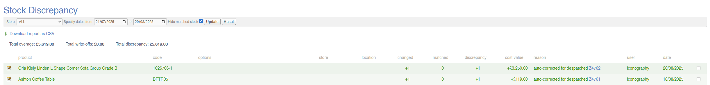
If a Sales Order line is despatched without stock, an entry will be made in the Stock Discrepancy report.
FAQs
Why allow despatch of items without stock?
In most cases, businesses want to tightly control stock levels so that only available inventory can be sold or dispatched. However, there are practical situations where allowing dispatch without stock is not just useful, but necessary:
- Stock Accuracy Issues – Real-world operations sometimes suffer from stock discrepancies (miscounts, damaged items, or delays in stock updates). If the system blocks dispatch completely, it can halt order fulfilment unnecessarily, even when the item is physically available.
-
Urgent Customer Needs – In retail or wholesale, meeting a critical customer deadline may be more important than stock accuracy. Dispatching without stock lets the business complete the order and correct the stock position afterward.
- Operational Flexibility – Some businesses prefer to allow managers (via the CMS) to override stock restrictions when exceptional circumstances arise. This gives control to responsible staff while maintaining normal safeguards at the POS.
Why allow wouldn't I despatch items without stock?
-
Stock Accuracy & Integrity
If items are dispatched without stock, the system no longer reflects reality. This undermines the accuracy of inventory data and makes it harder to trust reports. -
Overselling
Allowing dispatch without stock increases the risk of selling products that cannot actually be fulfilled, leading to customer dissatisfaction or cancelled orders. -
Financial Misreporting
Inventory valuation and cost-of-sales reporting rely on accurate stock records. Dispatching without stock can create gaps that distort financial reporting. -
Operational Confusion
Staff may assume goods are available when they are not, leading to errors, wasted time, and additional administration to fix discrepancies later. -
Loss Prevention & Control
Strict stock controls help prevent misuse, theft, or mistakes. Allowing dispatch without stock can weaken those safeguards.
Documents
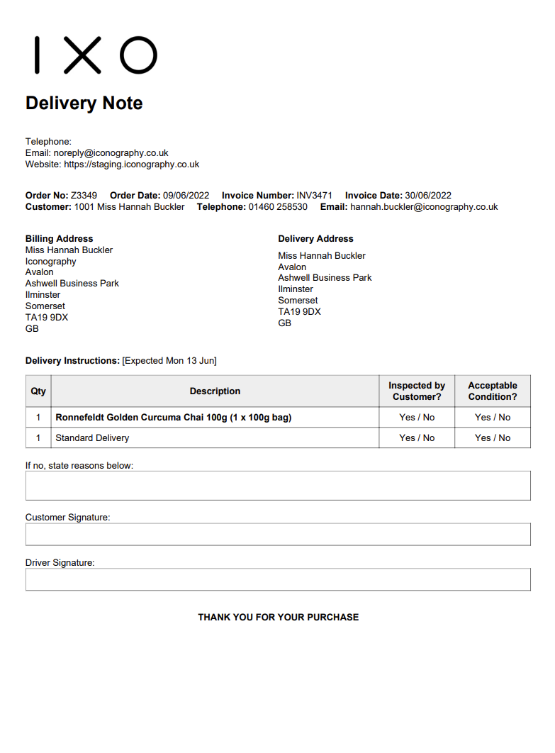
Delivery Notes
This will produce a form that can be used to confirm delivery with the Customer.
Picking List
A Picking List may be printed from various sections of the system. It will include essential information.
If you would prefer to only have one Sales Order per page, this can be configured within Site Settings
Example:
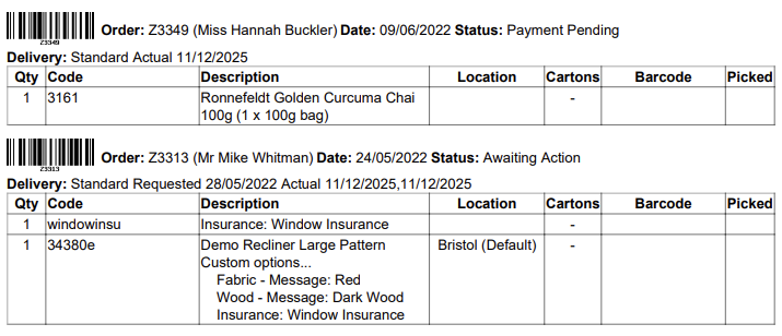
If the Location field is blank, that signifies that there is no stock allocated to the Sales Order line
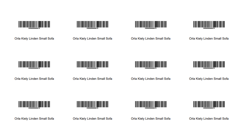
Product Labels
Product Labels will either be printed via a STAR printer, or via a standard A4 printer.
If you are using a standard printer, you can control the size of label (quantity per sheet) in Site Settings
These may be printed with and without prices.
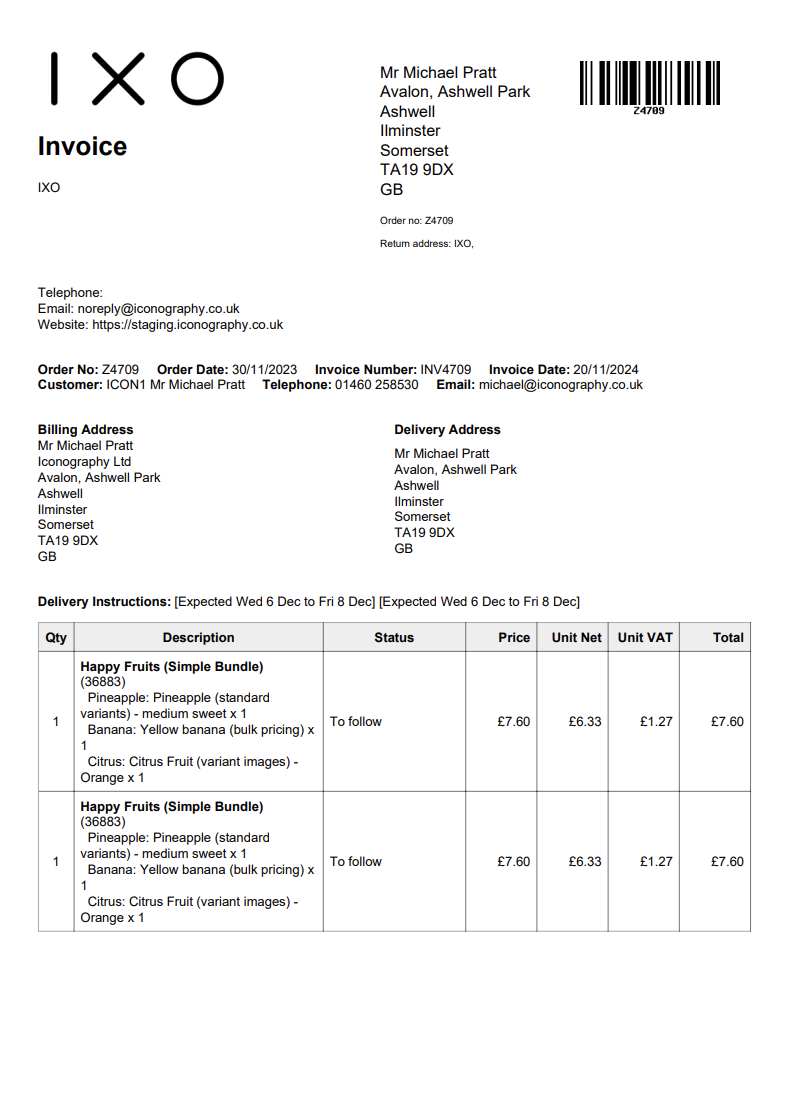
Sales Order Invoices
These are output for each Sales Order.
It is possible to customise the text that is output on these in Site Settings
Example:
Shipping Labels
Warehouse (Free Stock) Labels
Warehouse (Free Stock) Labels will either be printed via a STAR printer, or via a standard A4 printer.
These have more information on them, and the barcode will be linked to either the Variant or the USR, as appropriate.
Warehouse (Reservation) Labels
Warehouse (Reservation) Labels will either be printed via a STAR printer, or via a standard A4 printer.
These have more information on them, and the barcode will be linked to either the Variant or the USR, as appropriate.
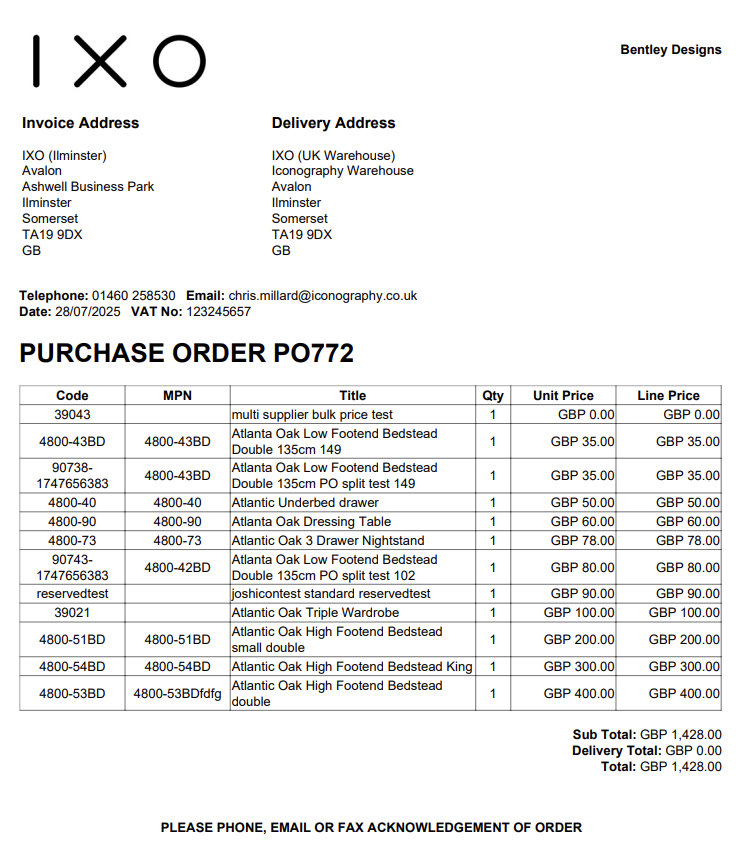
Purchase Order PDF
Bandwidth
Bandwidth is the amount of data that can be sent between your website and its visitors. Every time someone visits your site, data like images and text is transferred, using up bandwidth.
The more visitors you have or the larger your files are (like high-quality images or PDFs), the more bandwidth you’ll need. If you use more bandwidth than your hosting plan allows, your hosting costs may increase.
Modular Blocks
Summary
Version Control
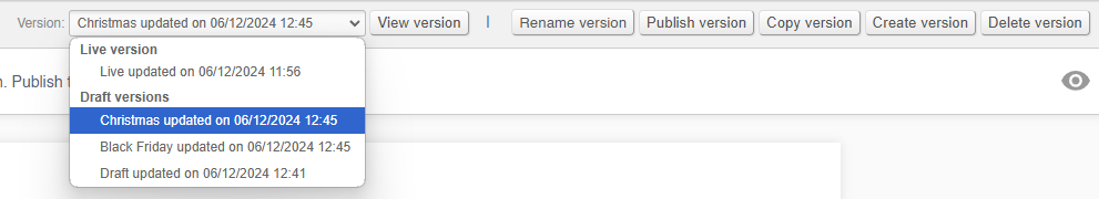
Every Modular Page comes with version control.
These are intended to allow users to work on multiple versions of the page, either to make changes in draft before putting them live, or to have multiple versions for different purposes:
Although all changes to Modular Pages are instant, you will not see them on the website unless you are editing the live version
FAQs
How do I make a new version?
To make a new version, either copy and existing version, or alternatively user the control to create a new version from scratch.
How do I switch between versions?
Use the drop down and select a version, then click 'view version'.
How do I rename a version?
Use the 'rename version' button in order to rename the version.
You can only rename the version that you are currently viewing.
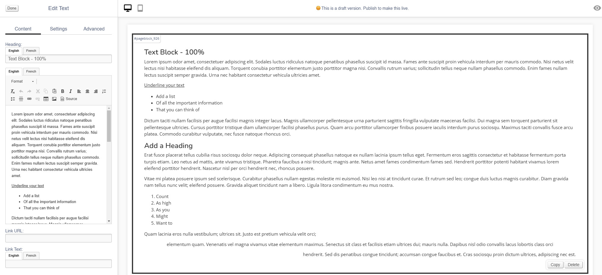
Text Blocks
Use this block to add large chunks of text to your page.
Appearance
Editing the Block
Content
| Field | Purpose |
| Heading | Enter a short block title - this will show above the main content of the block |
| Body Text | This is the main content of the block. Use the controls to format your text |
| Link URL |
Enter a link URL - if populated, this will add a call to action below the content of the block.
The position of this button can be controlled with the 'Link Position' control |
| Link Text |
Enter link text - if populated, this will change the text in a call to action below the content of the block
The position of this button can be controlled with the 'Link Position' control
If left blank, the button will read 'More' |
Settings
| Field | Purpose |
| Block Width |
Choose from:
|
| Visibility |
Set the block visibility from the list:
|
| Heading Position |
Alter the alignment of the block header:
|
| Link Position |
Alter the alignment of the link button:
|
Additional Options
| Field | Purpose |
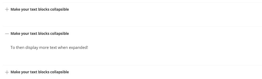
| Collapsible |
If set to yes, the whole Text block will be set as collapsible (see below)
Doing so will also adjust the Schema of the block; this will be flagged to search engines as an FAQ; the block Heading will be labelled as the question, and the Body Text as the answer |
Advanced
Padding
Adding padding will insert space within the current block; this will adjust the position of content within the block.
More information is available here.
Margin
The margin will add additional space around the current block.
More information is available here.
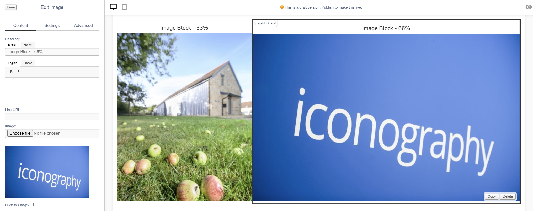
Image
Use this block to add simple images to your page.
There are also other blocks which can be used to add images:
- Carousel (small images on a swipeable carousel)
- Hero (large rotating banners)
- Parallax (an image that sits behind content, adding depth to a page)
- Feature (a styled image)
- Multi-Feature (multiple static images in a single block)
- Wide Feature (image with a block of text)
Appearance
Editing the Block
Content
| Field | Purpose |
| Heading | Enter a short block title - this will show above the main content of the block |
| Body Text |
This is the main content of the block. Use the controls to format your text
It will appear as a caption, below the image |
| Link URL | Enter a link URL - if populated, this will add a link to the image. |
| Image | Use the dialogue to select an image to upload |
| Alt Text |
Amend the Alt Text for the image |
| Delete Image | Use the tick box to delete an image - you will be asked to confirm your action |
Settings
| Field | Purpose |
| Block Width |
Choose from:
|
| Mobile Width |
Set the block width by selecting from the drop down:
|
| Visibility |
Set the block visibility from the list:
|
| Heading Position |
Alter the alignment of the block header:
|
| Background Colour | Choose a background colour for your image. Choose from recommended colours, or use a colour picker. |
Additional Options
| Field | Purpose |
| Invert Text Colour | Toggle to invert the text colour |
| Actual Size | Choose to display the image at actual size |
Advanced
Padding
Adding padding will insert space within the current block; this will adjust the position of content within the block.
More information is available here.
Margin
The margin will add additional space around the current block.
More information is available here.
Carousel
Use this block to add small images on a swipeable carousel.
There are also other blocks which can be used to add images:
- Image (simple images)
- Hero (large rotating banners)
- Parallax (an image that sits behind content, adding depth to a page)
- Feature (a styled image)
- Multi-Feature (multiple static images in a single block)
- Wide Feature (image with a block of text)
Appearance
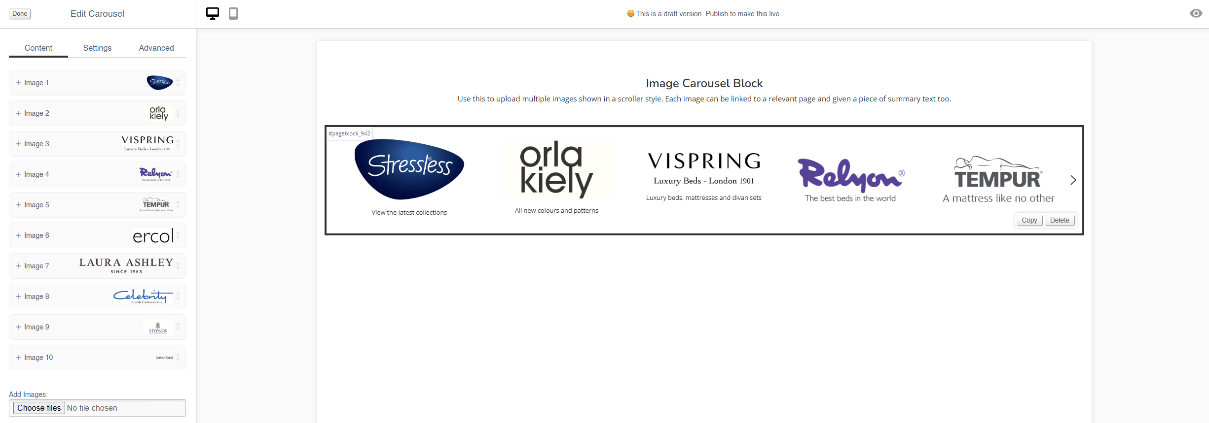
Editing the Block
Content
Each image has an expandable menu, allowing it to be edited individually.
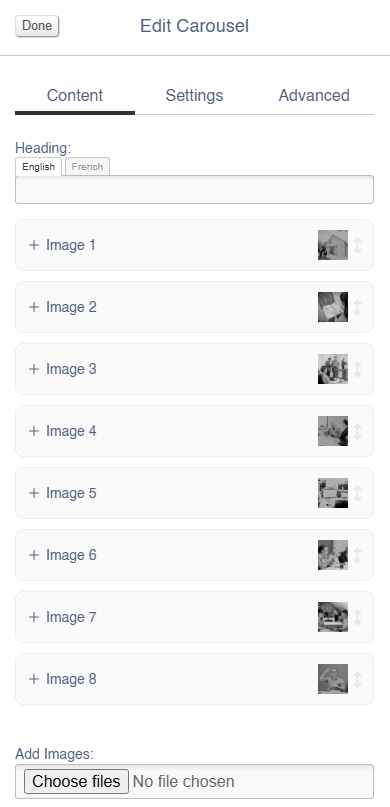
Images may be dragged around to resequence them.
| Field | Purpose |
| Link URL | Enter a link URL - if populated, this will add a link to the image |
| Alt Text |
Amend the Alt Text for the image |
| Summary | Enter text that will be shown below the image |
| Delete Image | Use the tick box to delete an image - you will be asked to confirm your action |
Use the Image dialogue to select images to upload to this block.
Settings
Block width is not editable for the Hero block - it is always set to 100%.
| Field | Purpose |
| Visibility |
Set the block visibility from the list:
|
| Items Visible |
Defines how many images will be visible on page load |
| Items Visible (mobile) |
Defines how many images will be visible on page load when on a mobile device |
Additional Options
| Field | Purpose |
| Mouse Drag | Allow a user to mouse drag/swipe to scoll through the Carousel |
| Alt Style | Alters the amount of padding between each image within the block |
| Caption on Right? | Choose to show the Summary text below the image, or to the right of the image |
| Auto-play | Set the Carousel to auto scroll |
| Loop? | Set the auto scroll on a loop |
Advanced
Padding
Adding padding will insert space within the current block; this will adjust the position of content within the block.
More information is available here.
Margin
The margin will add additional space around the current block.
More information is available here.
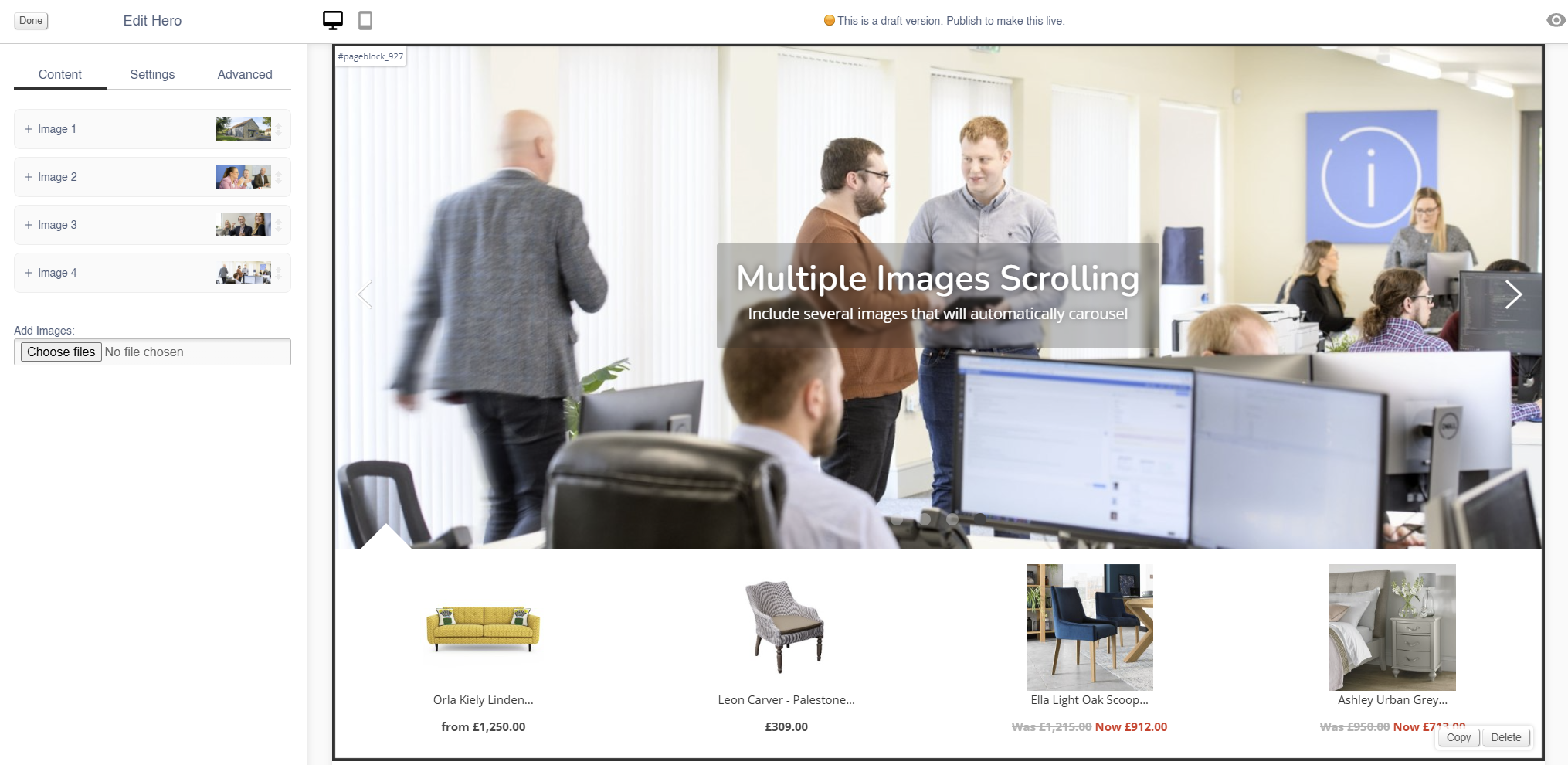
Hero
Use this block to add large rotating banners with linked products.
There are also other blocks which can be used to add images:
- Image (simple images)
- Carousel (small images on a swipeable carousel)
- Parallax (an image that sits behind content, adding depth to a page)
- Feature (a styled image)
- Multi-Feature (multiple static images in a single block)
- Wide Feature (image with a block of text)
Appearance
Editing the Block
Each image has an expandable menu, allowing it to be edited individually.
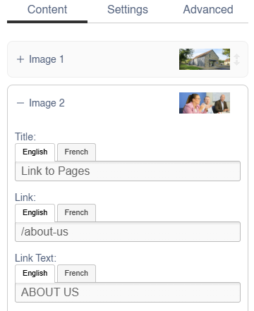
Images may be dragged around to resequence them.
Content
| Field | Purpose |
| Title | Enter a short title - this will be output as a text overlay, on top of the image |
| Link URL | Enter a link URL - if populated, this will add a link to the image. |
| Link Text |
Text to be shown with a button, if a link is set
If left blank, the whole image will act as a button |
| Additional Text | Enter some short text - this will be output as a text overlay, on top of the image below the title |
| Related Products |
Search for Products by name or SKU Code to link them to this hero image
They will display below the image
If you have multiple images in a Hero Block, the Products will change along with the image |
| Delete This Image? | Use this control to delete an image |
Use the Image dialogue to select images to upload to this block.
Settings
| Field | Purpose |
| Block Width |
Choose from:
|
| Visibility |
Set the block visibility from the list:
|
| Text Colour |
Choose from:
|
| Text Position |
Alter the alignment of the block text:
|
Additional Options
These options allow you to auto assign Products to Hero Images, without assigning specific Products.
| Field | Purpose |
| Allow header overlap | Allows for the creation of transparent headers |
| Include featured products | Auto add featured products to the images in this Hero block |
| Include recommended products | Auto add recommended products to the images in this Hero block |
| Include sale products | Auto add sale products to the images in this Hero block |
Advanced
Padding
Adding padding will insert space within the current block; this will adjust the position of content within the block.
More information is available here.
Margin
The margin will add additional space around the current block.
More information is available here.
Parallax
Use this block to add an image that sits behind content, adding depth to a page.
There are also other blocks which can be used to add images:
- Image (simple images)
- Carousel (small images on a swipeable carousel)
- Hero (large rotating banners)
- Feature (a styled image)
- Multi-Feature (multiple static images in a single block)
- Wide Feature (image with a block of text)
Appearance

Editing the Block
Content
| Field | Purpose |
| Heading | Enter a short block title - this will show above the main content of the block |
| Text |
This is the main content of the block. Use the controls to format your text
It will appear as a caption, below the image |
| Link | Enter a link URL - if populated, this will add a link to the image. |
| Link Text |
Text to be shown with a button, if a link is set
If left blank, the whole image will act as a button |
| Delete Image | Use the tick box to delete an image - you will be asked to confirm your action |
Use the Image dialogue to select images to upload to this block.
Settings
| Field | Purpose |
| Block Width |
Choose from:
|
| Visibility |
Set the block visibility from the list:
|
| Text Position |
Alter the alignment of the block text:
|
| Text Colour |
Choose from:
|
Additional Options
| Field | Purpose |
| Full Screen | Toggle a large or small version of the parallax image |
| Box? | Toggle a box to surround the text |
| Filter? |
Toggle a filter on the image, which will make it darker if applied
This should be used to ensure high contrast between the image and overlaid text |
Advanced
Padding
Adding padding will insert space within the current block; this will adjust the position of content within the block.
More information is available here.
Margin
The margin will add additional space around the current block.
More information is available here.
Callout
Use this to add small blocks of text with a coloured background.
Appearance
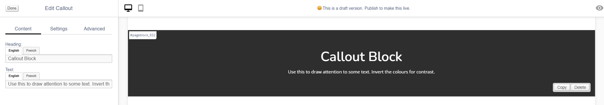
Content
| Field | Purpose |
| Heading | Enter a short block title |
| Text | This is the main content of the block. Use the controls to format your text |
Settings
| Field | Purpose |
| Block Width |
Choose from:
|
| Visibility |
Set the block visibility from the list:
|
| Background Colour | Choose a background colour for your image. Choose from recommended colours, or use a colour picker. |
Additional Options
| Field | Purpose |
| Invert text colour | Toggle to invert the text colour |
Advanced
Padding
Adding padding will insert space within the current block; this will adjust the position of content within the block.
More information is available here.
Margin
The margin will add additional space around the current block.
More information is available here.
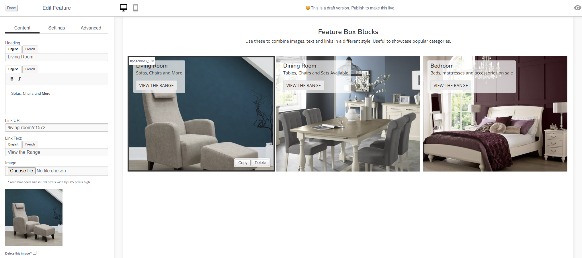
Feature
Use this block to add a styled image.
There are also other blocks which can be used to add images:
- Image (simple images)
- Carousel (small images on a swipeable carousel)
- Hero (large rotating banners)
- Parallax (an image that sits behind content, adding depth to a page)
- Multi-Feature (multiple static images in a single block)
- Wide Feature (image with a block of text)
Appearance
Editing the Block
Styling will be applied to this block as part of your website build - this will then remain constant across all pages.
Content
| Field | Purpose |
| Heading | Enter a short title - this will be output as a text overlay, on top of the image |
| Additional Text | Enter some short text - this will be output as a text overlay, on top of the image below the title |
| Link URL | Enter a link URL - if populated, this will add a link to the image. |
| Link Text |
Text to be shown with a button, if a link is set
If left blank, the whole image will act as a button |
| Delete This Image? | Use this control to delete an image |
Use the Image dialogue to select images to upload to this block.
Settings
| Field | Purpose |
| Block Width |
Choose from:
|
| Mobile Width |
Choose from:
|
| Visibility |
Set the block visibility from the list:
|
| Text Colour |
Choose from:
|
Additional Options
These options allow you to auto assign Products to Hero Images, without assigning specific Products.
| Field | Purpose |
| Text underneath | Output the text beneath the image, instead of over the image |
| Text central | Output the text centrally on the image |
| Do not crop to fit | Toggle to retain the aspect ratio of the image uploaded |
Advanced
Padding
Adding padding will insert space within the current block; this will adjust the position of content within the block.
More information is available here.
Margin
The margin will add additional space around the current block.
More information is available here.
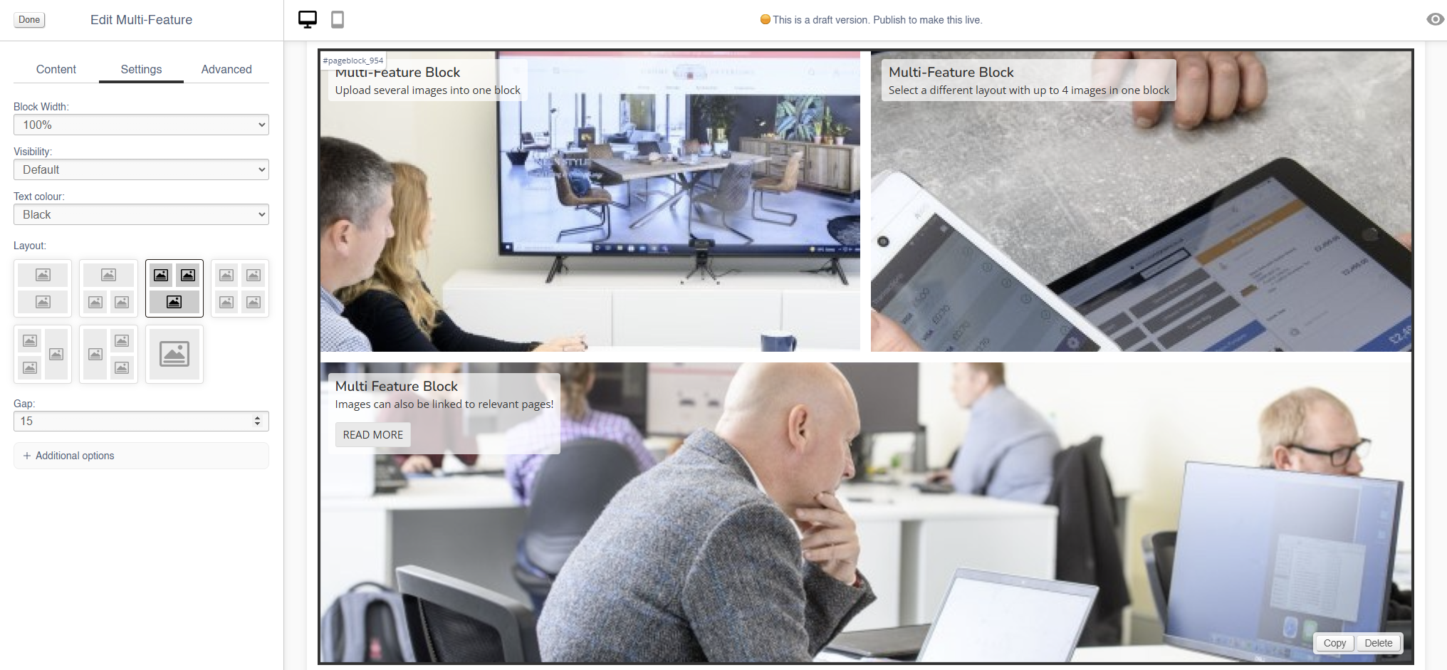
Multi-Feature
Use this block to add multiple static images in a single block.
There are also other blocks which can be used to add images:
- Image (simple images)
- Carousel (small images on a swipeable carousel)
- Hero (large rotating banners)
- Parallax (an image that sits behind content, adding depth to a page)
- Feature (a styled image)
- Wide Feature (image with a block of text)
Appearance
Editing the Block
To best configure this block, it is important to select your layout under Settings (see below) before you upload any images
Each image has an expandable menu, allowing it to be edited individually.
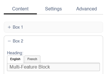
Content
| Field | Purpose |
| Heading | Enter a short title - this will be output as a text overlay, on top of the image |
| Text | Enter some short text - this will be output as a text overlay, on top of the image below the title |
| Alt Text |
Amend the Alt Text for the image |
| Link URL | Enter a link URL - if populated, this will add a link to the image. |
| Link Text |
Text to be shown with a button, if a link is set
If left blank, the whole image will act as a button |
| Delete This Image? | Use this control to delete an image |
Use the Image dialogue to select images to upload to this block.
Settings
| Field | Purpose |
| Block Width |
Choose from:
|
| Visibility |
Set the block visibility from the list:
|
| Text Colour |
Choose from:
|
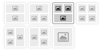
| Layout |
Use the control to select the layout - this may alter the number of images in this block
|
| Gap |
Choose the number of pixels between the images within this block |
Additional Options
These options allow you to auto assign Products to Hero Images, without assigning specific Products.
| Field | Purpose |
| Text central | Output the text centrally on the image |
Advanced
Padding
Adding padding will insert space within the current block; this will adjust the position of content within the block.
More information is available here.
Margin
The margin will add additional space around the current block.
More information is available here.
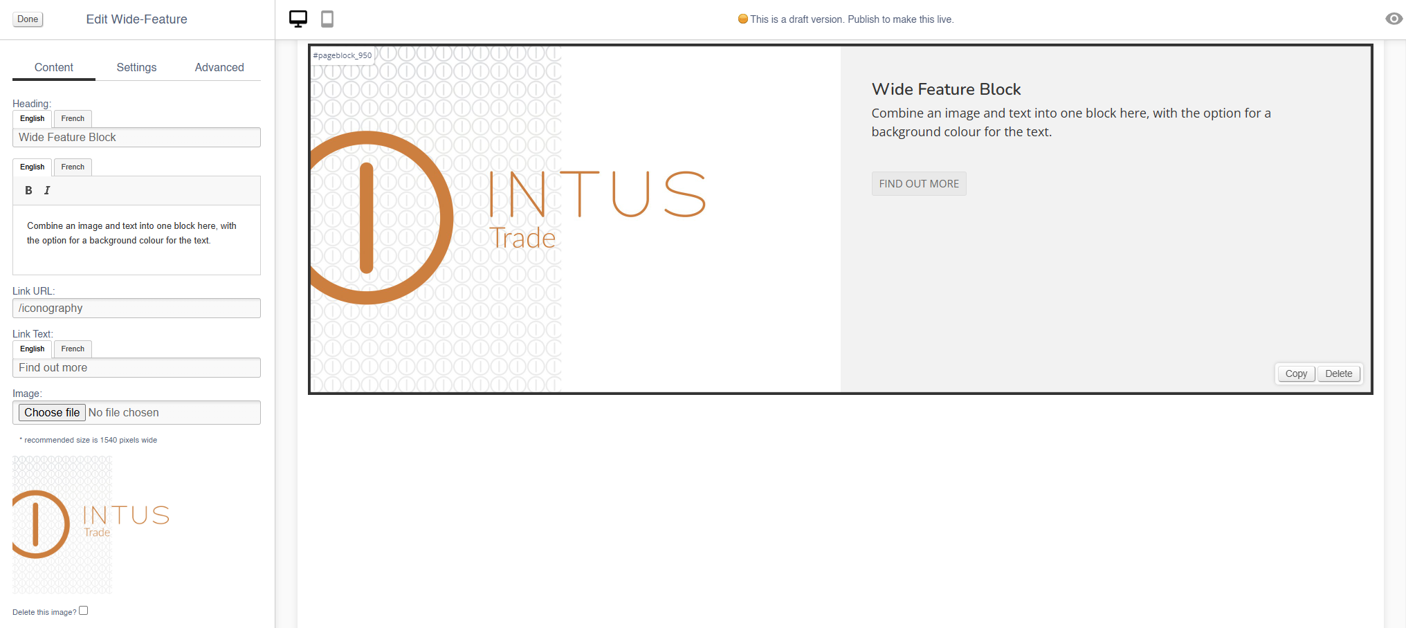
Wide-Feature
Use this block to add image with a block of text.
There are also other blocks which can be used to add images:
- Image (simple images)
- Carousel (small images on a swipeable carousel)
- Hero (large rotating banners)
- Parallax (an image that sits behind content, adding depth to a page)
- Feature (a styled image)
- Multi-Feature (multiple static images in a single block)
Appearance
Editing the Block
Content
| Field | Purpose |
| Heading | Enter a short title - this will be output as a text overlay, on top of the image |
| Additional Text | Enter some short text - this will be output as a text overlay, on top of the image below the title |
| Alt Text |
Amend the Alt Text for the image |
| Link URL | Enter a link URL - if populated, this will add a link to the image. |
| Link Text |
Text to be shown with a button, if a link is set
If left blank, the whole image will act as a button |
| Delete This Image? | Use this control to delete an image |
Use the Image dialogue to select images to upload to this block.
Settings
| Field | Purpose |
| Block Width |
Choose from:
|
| Visibility |
Set the block visibility from the list:
|
| Background colour |
Choose a background colour for your image
Choose from recommended colours, or use a colour picker |
Additional Options
These options allow you to auto assign Products to Hero Images, without assigning specific Products.
| Field | Purpose |
| Invert text colour | Toggle to invert the text colour |
| Do not crop to fit | Toggle to retain the aspect ratio of the image uploaded |
| Reverse layout | swap the position of the image and the text |
Advanced
Padding
Adding padding will insert space within the current block; this will adjust the position of content within the block.
More information is available here.
Margin
The margin will add additional space around the current block.
More information is available here.
Products
Use this to insert blocks of Products onto your page.
This will add live products to your page, so if any product data is updated, this page will also be automatically updated.
Disabled products are not shown within the block; add automated products to fill any gaps (see below for more details)
Appearance
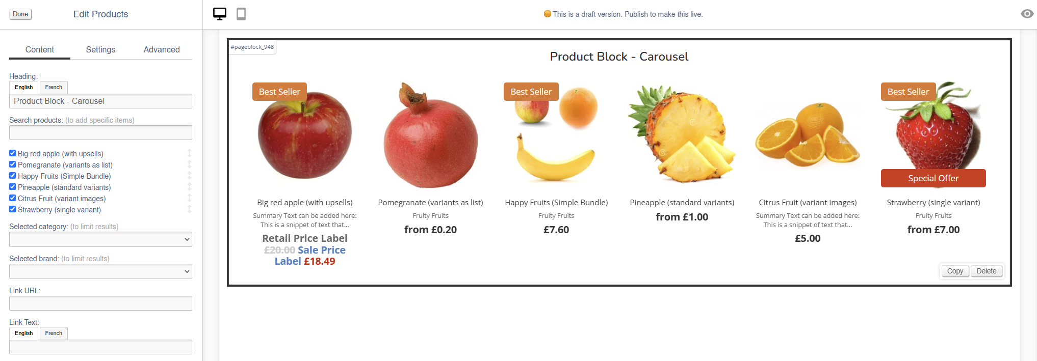
Content
| Field | Purpose |
| Heading | Enter a short block title - this will show above the main content of the block |
| Search Product | Use this to search for specific products to display within this block |
| Selected Category |
Select a Category - this will filter automated Products
If left blank, no filter will be applied |
| Selected Brand |
Select a Brand - this will filter automated Products
If left blank, no filter will be applied |
| Link URL |
Enter a link URL - if populated, this will add a call to action below the content of the block. |
| Link Text |
Enter link text - if populated, this will change the text in a call to action below the content of the block
If left blank, the button will read 'More' |
Settings
| Field | Purpose |
| Block Width |
Choose from:
|
| Visibility |
Set the block visibility from the list:
|
| Heading Position |
Alter the alignment of the block header:
|
| Link Position |
Alter the alignment of the link:
|
| Display |
|
| Border Colour |
Choose from:
|
| Max Rows |
Select the maximum number of rows to appear:
|
Additional Options
These controls should be used in conjunction with the Category and Brand filters in the Content section
| Field | Purpose |
| Include featured products? | Auto add featured products to the images in this content block |
| Include home products? | Auto add products marked as 'home page featured' to this content block |
| Include recommended products? | Auto add recommended products to the images in this content block |
| Include hot this week products? | Auto add 'hot this week' products to this content block |
| Include most searched products? |
Auto add 'most searched' products to this content block |
| Include sale products? | Auto add sale products to the images in this content block |
Advanced
Padding
Adding padding will insert space within the current block; this will adjust the position of content within the block.
More information is available here.
Margin
The margin will add additional space around the current block.
More information is available here.
Video
Use this to add a video to your page.
Appearance
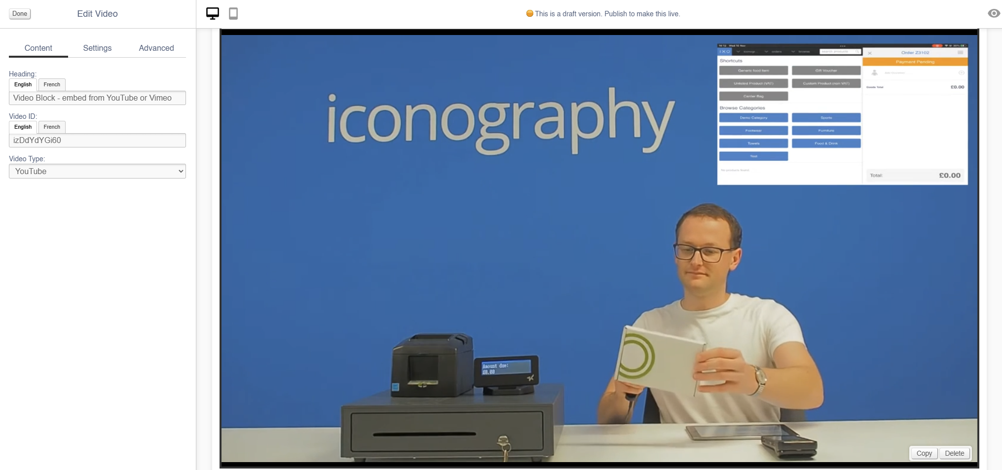
Editing the Block
Content
See here for more information about locating the Video IDs for Youtube and Vimeo.
| Field | Purpose |
| Heading | Enter a short block title - this will show above the main content of the block |
| Video ID | Enter the unique ID of the video you wish to add |
| Video Type |
Choose from:
|
Settings
| Field | Purpose |
| Block Width |
Choose from:
|
| Visibility |
Set the block visibility from the list:
|
| Heading Position |
Alter the alignment of the block header:
|
Additional Options
| Field | Purpose |
| Auto-play? | Toggle auto-play for the video (e.g. if the video automatically plays on page load) |
| Loop? | Toggle whether the video will or will not loop |
| Hide controls? | Hide player controls |
| Allow header overlap? |
Toggles whether the video shows behind the header, as per Hero banners
Important: User must also 'hide page title' to enable this |
| Portrait? | Toggle if this is a Portrait video, e.g. a Youtube Short |
Advanced
Padding
Adding padding will insert space within the current block; this will adjust the position of content within the block.
More information is available here.
Margin
The margin will add additional space around the current block.
More information is available here.
Enquiry Form
Use this to add an Enquiry Form to any page.
To use this content block, you must first have set up the Form that you wish to embed.
Appearance
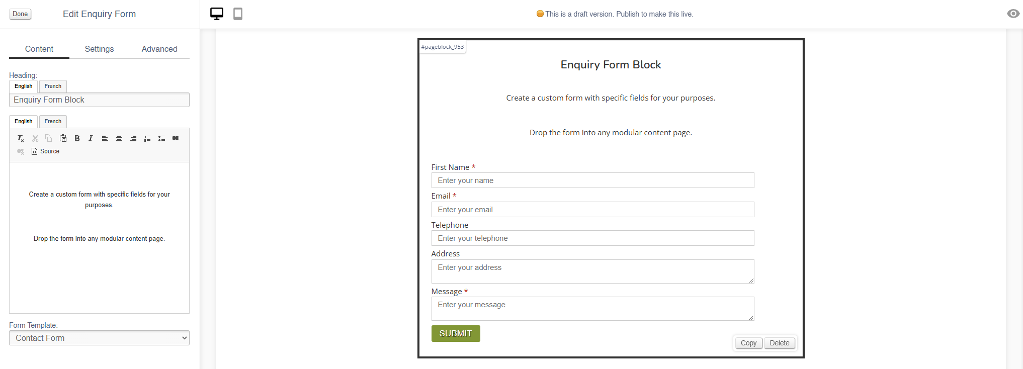
Editing the Block
Content
| Field | Purpose |
| Heading | Enter a short block title - this will show above the main content of the block |
| Body Text | Enter some short text that will show above the form |
| Form Template | Select you Form Template from the list |
Settings
| Field | Purpose |
| Block Width |
Choose from:
|
| Visibility |
Set the block visibility from the list:
|
| Heading Position |
Alter the alignment of the block header:
|
Advanced
Padding
Adding padding will insert space within the current block; this will adjust the position of content within the block.
More information is available here.
Margin
The margin will add additional space around the current block.
More information is available here.
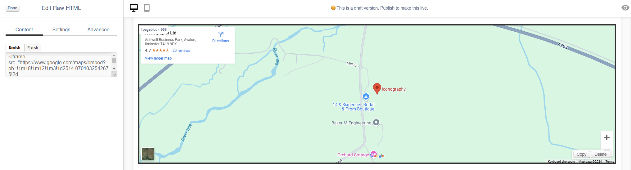
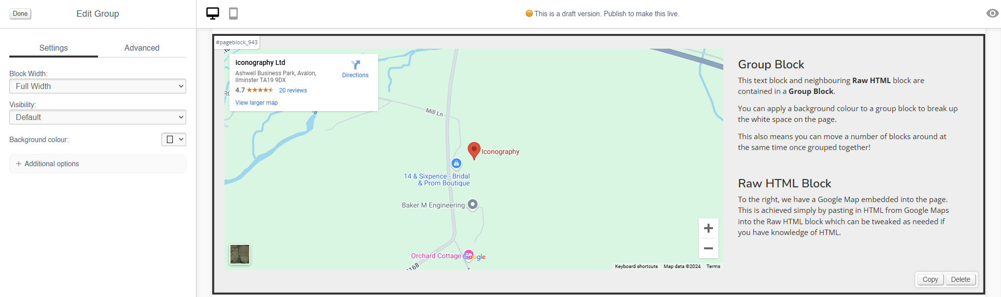
Raw HTML
Use this content block to embed raw HTML and third party code, e.g. for a Google Map.
When embedding a script or an iframe from a third party domain, it will be locked, unless that domain is on the permitted list.
Embedding third party code is risky and may cause harm to your website
You may have to contact Iconography prior to using these blocks, as third party domains will be blocked unless they have been whitelisted, e.g. for a Google Map
Appearance
Editing the Block
Content
| Field | Purpose |
| HTML | Paste your HTML into here |
Settings
| Field | Purpose |
| Block Width |
Choose from:
|
| Visibility |
Set the block visibility from the list:
|
Advanced
Padding
Adding padding will insert space within the current block; this will adjust the position of content within the block.
More information is available here.
Margin
The margin will add additional space around the current block.
More information is available here.
Group
Group blocks are used to create nested collections of blocks; they may also be given a background colour, allowing you to break up the appearance of a page.
Blocks may be moved within a group, or the block may be moved on the page, which will update move its contents too.
Adjusting a Group will adjust the blocks within it as well, e.g. reducing the width of the Group will make the blocks within it smaller, or changing the background colour of the Group will override the background colour of blocks within it.
To add a block to a Group, simply drag and drop it over the Group.
Appearance
Editing the Block
Settings
| Field | Purpose |
| Block Width |
Choose from:
|
| Visibility |
Set the block visibility from the list:
|
| Background Colour | Choose a background colour for your image. Choose from recommended colours, or use a colour picker. |
Additional Options
| Field | Purpose |
| Invert text colour | Toggle to invert the text colour |
| Content contained? | Toggle to contain the Content - this will affect the maximum width available to the content in the Group |
Advanced
Padding
Adding padding will insert space within the current block; this will adjust the position of content within the block.
More information is available here.
Margin
The margin will add additional space around the current block.
More information is available here.
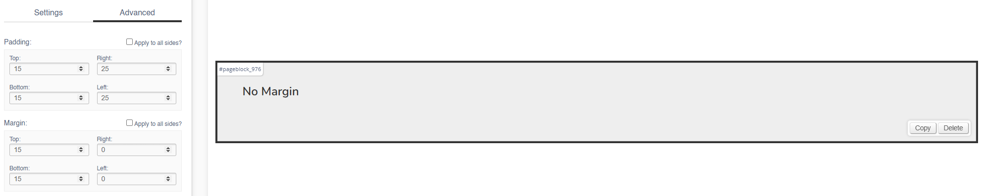
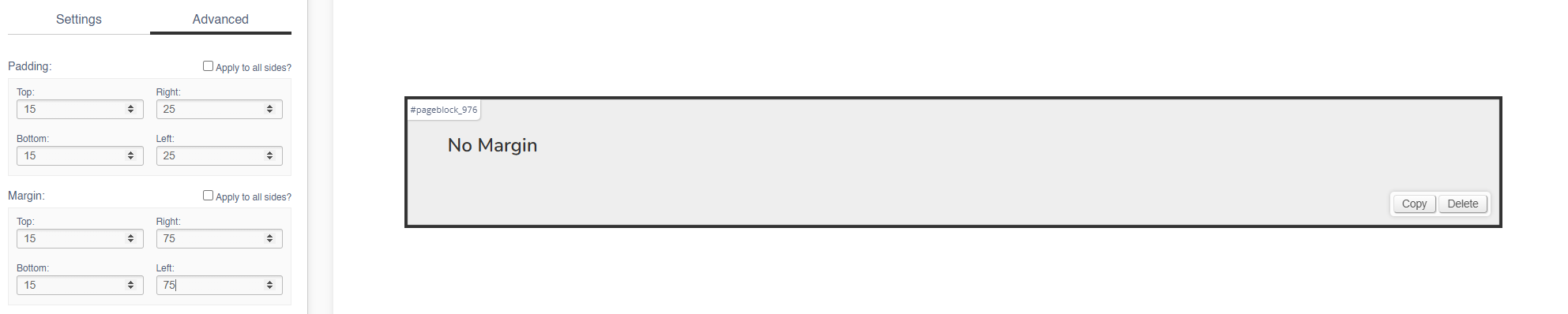
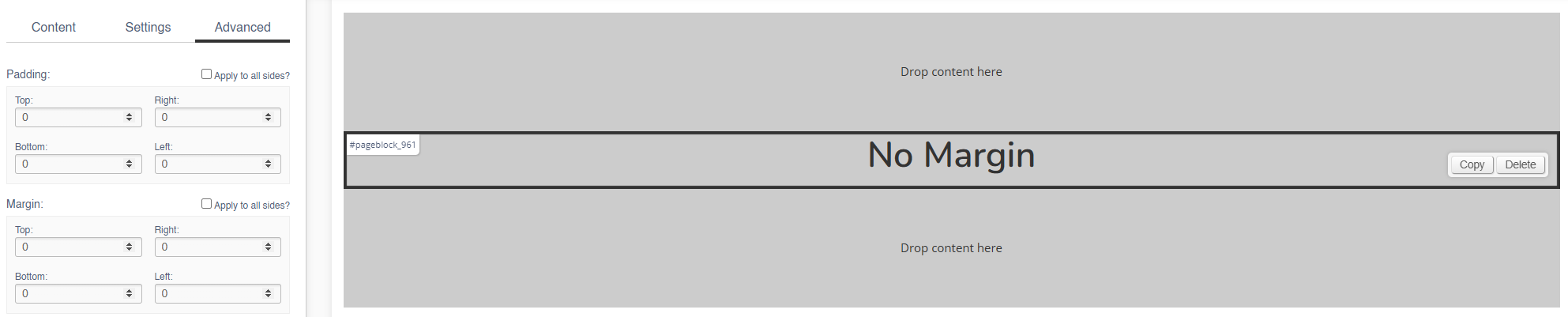
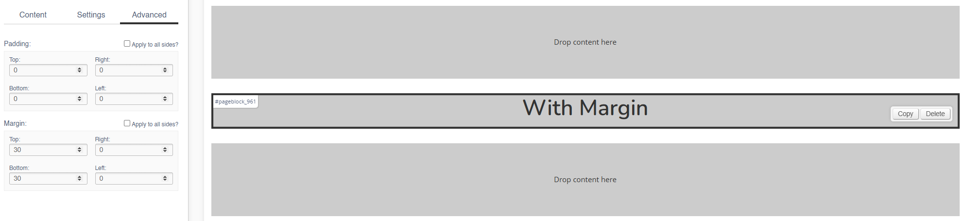
Margin
The margin will add additional space around the current block.
Margin (Left & Right)
No Margin
The block fills it's width (in this case, 100%).
With Margin
The width of the block is reduced by the left/right margin (in this case, 75px).
Margin (Top & Bottom)
No Margin
The blocks are touching, with no gaps.
With Margin
There is now a gap between the blocks.
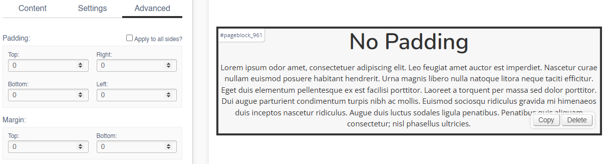
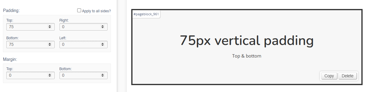
Padding
Adding padding will insert space within the current block; this will adjust the position of content within the block.
Padding (Left & Right)
Add left and right padding to indent the content.
No Padding
With Padding
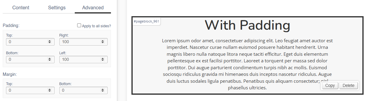
Padding (Top & Bottom)
Adding padding to the top of bottom of the block will adjust the height of the block:
No Padding
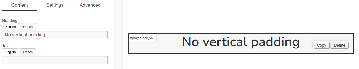
With Padding
Content
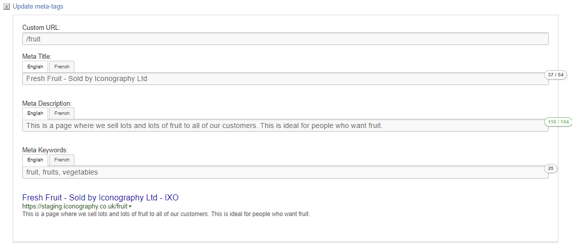
Meta Tags
Use this control to update meta data and add custom URLs to your pages.
Meta titles and descriptions are essential HTML elements that help define a webpage's content for search engines and users. The meta title summarises the page in a few words, while the meta description provides a brief overview. Both are crucial for improving search engine optimization (SEO) and increasing click-through rates.
Meta Keywords are used to improve the accuracy of onsite search.
Setup
Automated Setup
IXO Commerce will autogenerate meta data and URLs for your page.
The Meta Title will be based on the page name, to which IXO Commerce will append your business name. e.g. 'Lego - Example Retailer'.
The Meta Description will be based on the page content, typically a description or a summary.
Meta Keywords are not automatically managed.
The URL structure is autogenerated based on the page name, as well as any hierarchy, e.g. /category/subcategory/productname.
Manual Setup
Use the fields to setup the content.
| Field | Purpose |
| Custom URL | Use this to define a Custom URL for a page |
| Meta Title | Use this to set a manual Meta Title |
| Meta Description | Use this to set a manual Meta Description |
| Meta Keywords | Use this to set your Meta Keywords |
Meta Keywords are used as additional keywords for the eCommerce site search
How Meta Tags Display
A summary of how these display will be shown below the fields. This will be updated as you type.
FAQs
Can I manage my Meta Tags in bulk?
Meta Data for Products may be managed in Bulk via the CSV Import/Export
Loyalty Scheme
The IXO Commerce loyalty scheme works on a simple basis. A registered customer will earn a certain number of points based on their spend.
Each of those loyalty points is worth a fixed amount.
Both the 'loyalty points earned per £ spent' and 'loyalty point value' are defined with Site Settings.
Example
A system is set up to award a loyalty point for every £10 spent. Each point is worth 10p.
A customer has previously placed an order for £676; for their next order, they are prompted to use their loyalty balance of £6.70.
CMS
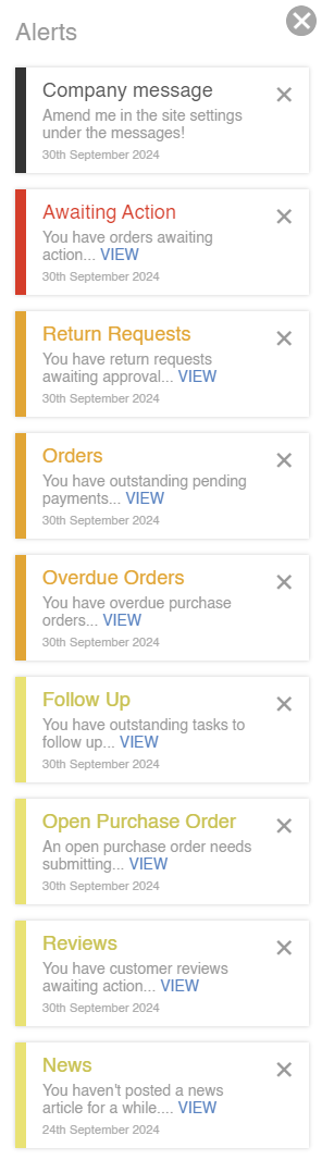
Alerts
The Alerts are a list of actions that you need to take today. These will slide out automatically on login, or can be accessed via the red roundel in the top right hand corner of the screen.

They display like this, and will often have links to encourage action:
Bookmarks
The Bookmarks are a series of shortcuts that appear in the CMS to aid frequent navigation. These are unique to each user.
Use the shortcut to add a Bookmark.
Right mouse click to remove a Bookmark.
Some standard Bookmarks are controlled via Site Settings.
It is also possible to reorder your Bookmarks via drag and drop.
How it Displays
Show/Hide Disabled
On various screens in the CMS, it is possible to choose to show/hide Disabled items.
By default, disabled items will be hidden
For these purposes, disabled items include those which are actively disabled or archived. These include, but are not limited to:
- Disabled Products
- Archived Products
- Disabled Categories
- Empty Dynamic Categories
- Disabled Collections
- Disabled Brands
- Disabled Suppliers
Disabled items will still display in all reports and filters
Label Printing
This logic is used when printing labels.
Warehouse Labels (reserved stock)
This grabs all Sales Order Lines that follow these rules:
- Sales order status:
- Contains the word ‘despatch’
- Contains the word ‘packing’
- Contains the word ‘pending’
- Contains the term ‘awaiting action’
- Is ‘on order’
- Is ‘on transfer’
- Is ‘unallocated’
- Line is not acknowledged
- Line is not despatched
- Line is not cancelled
Warehouse Labels (free stock)
This function will first grab all stock records that exist on the system and will order by oldest first. It
will then retrieve all reserved labels using the above section.
Whilst looping through the reserved labels and stock records, if the reserved label shares a PO with
the stock record, we will subtract any stock that is reserved to sales orders so that the free stock
labels don’t print POs that are used for these sales orders.
Here are some examples:
- SKU XYZ has 3 stock linked to PO123. Order Z123 has 1 qty linked to the PO. 1 is subtracted
from the stock record resulting in 2 free stock labels that are linked to PO123 - SKU XYZ has 1 stock linked to PO123. Order Z123 has 3 qty linked to the PO. This will result in
0 free stock labels being linked to PO123
Once the calculations are complete, the system will print free stock labels using the remaining stock records.
If more labels have been requested to be printed than there is stock, then the excess labels will be
printed with no PO number on them.
Retrieving labels via a PO
This function grabs all lines on a PO and loops through them. For each line, we will try to find sales
orders linked to it by checking:
- Order line is linked to this PO
- Order line is the same SKU and USR (if set)
- Order line is not cancelled
- Order status is not ‘draft'
If any sales orders are found, we will mark these lines as reserved labels. The rest of the quantity
against the PO will be marked as free stock.
Workflows
Finding Video IDs
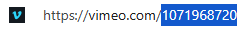
YouTube
These can be found in the video URL:

Vimeo
These can be found in the video URL:
Reporting
Margin Calculation
Profit margins are calculated as a percentage of the cost of a sale vs the revenue generated by it.
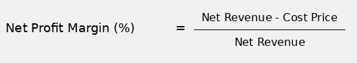
Margins are calculated per Sales Order line, which will then be averaged as needed for individual reports, Sales Order level margin, etc.
Examples
Positive Margin
| Gross sale | Net sale | Cost | Net profit | Net margin |
|---|---|---|---|---|
| £120.00 | £100.00 | £80.00 | £20.00 | 20% |
| £180.00 | £150.00 | £100.00 | £50.00 | 33.33% |
| £240.00 | £200.00 | £100.00 | £100.00 | 50% |
| £300.00 | £250.00 | £150.00 | £100.00 | 40% |
| £90.00 | £75.00 | £60.00 | £15.00 | 20% |
| £200.00 | £166.67 | £100.00 | £66.67 | 40% |
Negative Margin
| Gross sale | Net sale | Cost | Net profit | Net margin |
|---|---|---|---|---|
| £60.00 | £50.00 | £100.00 | -£50.00 | -100% |
| £96.00 | £80.00 | £100.00 | -£20.00 | -25% |
| £120.00 | £100.00 | £120.00 | -£20.00 | -20% |
| £240.00 | £200.00 | £250.00 | -£50.00 | -25% |
| £36.00 | £30.00 | £90.00 | -£60.00 | -200% |
| £50.00 | £41.67 | £100.00 | -£58.33 | -140% |
Exclusions
In addition to this, there are several specific exclusions:
- Products with a NULL cost price are omitted from all margin reporting
- Line discounts are included in margin calculation (e.g. uses line discounts to reduce the value of the sold item before working out margin)
- Excludes cancelled, deleted and returned lines (these have no value for working out margin)
- Excludes draft, quote, abandoned and cancelled orders (these are not valid)
FAQs
How does IXO Commerce calculate margin?
It uses the Net Margin method.
Does IXO Commerce use any other methods?
No. ICO Commerce doesn't use Gross Margin, Markup, Profit or Loss on Cost or Operating Margin.
My margin is showing as less than -100%, does this mean that I have lost more money than the item cost?
No. This is because when calculating Net Margin, everything is relative to the Net Profit and Cost Price. Think of it as selling something at double the cost price will be a 100% Net Margin, and selling it for half the Cost Price will be a -100% profit margin.
CRM
Adding Notes and Tasks
Notes may be added to Tasks, Customers, Sales Orders, Purchase Orders and Stock Transfers; the process is the same for each one.
Task categories are controlled within Site Settings
On Sales Orders, it is possible to email the note directly to the Customer; this email will include any attachments you upload to the Note
How to add a Note or a Task
1. Click into this box to type a note

2. Click add attachments to the note

Tip: There is a file size limit, but it is possible to add multiple files simultaneously; use this to add PDFs, images and short videos
3. Choose your files from the dialogue, or alternatively drag and drop them onto the 'choose files' button

Tip: You have the option to save this as a note or to turn it into a Task
4. To turn this into a task, click the appropriate button

5. Make you selections, and then click to 'create task'; this will save the note and add a Task

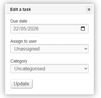
Edit a Task
Use this control to edit a Task.
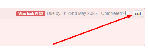
This control may be used in order to change:
- the User responsible for the Task
- the date the Task is due
- the category of the Task
Simply use the dialogue to make the amends and click save.
Sales Order Management
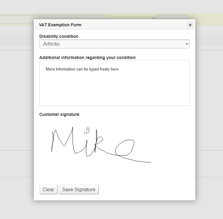
VAT Exemption Form
Use this dialogue box to add a VAT Exemption Form to a Sales Order. It may be added from the POS or from the Sales Order screen in the CMS.
VAT Exemption reasons may be edited in Site Settings
When adding a customer signature, this may be drawn with a mouse, or on a touch screen device.
The form will be added as an attachment on a note against the order.
Refund to Voucher
When processing a refund, it is possible to process a refund as a Voucher.
If done, this will automatically create a voucher linked to that Customer's email address.
This can be done via the CMS or via the POS
Discontinued
Photo Gallery
This feature is no longer supported.